- Blog
- 19 Discount Popup Examples to Maximize Conversions in 2025
19 Discount Popup Examples to Maximize Conversions in 2025
-
Nikolett Lorincz
- Conversion
- 6 min read
Table of Contents
Most marketers rely on popups to collect emails, and we’re all for it. But if that’s all you’re using popups for, chances are you’re leaving money on the table.
When done right, popups can drive sales directly and funnel visitors to your checkout.
In this guide, we’ll go over 19 discount popup examples, why they’re effective, and ways to roll out similar promotions on your site.
Let’s dive right in.
What is a discount popup?
A discount popup is an overlay that appears on a website (typically an ecommerce store), promoting a discount offer in exchange for certain actions, such as subscribing to a newsletter.
These popups are designed to capture the attention of new visitors and provide an incentive to take immediate action.
Discount popups can be triggered in various ways: they may appear after a user has been on the site for a specific amount of time, when they attempt to leave the page, or while they’re browsing specific products.
Commonly, they offer a percentage off or a dollar amount discount, free shipping, or a limited-time deal.
19 discount pop-up examples to inspire you
Popup overlays can be a highly effective way of calling attention to your discount offer.
But there’s no one-size-fits-all tactic to promote your special discount with a popup—the approach you take will depend on your store and your goals.
Below, we’ve broken down a variety of offers and promos you can use to level up your own discount popup strategy.
Free shipping popups
A staggering two-thirds of consumers look up free shipping thresholds on websites before adding items to their carts. Including free shipping as part of your discount popups is a smart move not only for grabbing visitors’ attention but also for increasing order value.
Let’s take a look at some examples below.
1. SwissWatchExpo
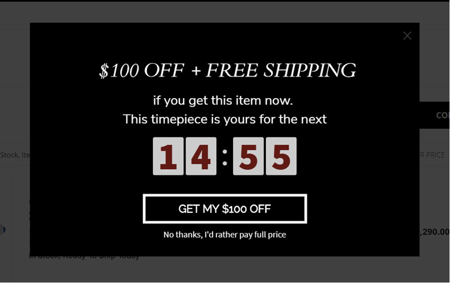
What this popup does well:
- The countdown timer creates a sense of urgency, pushing visitors to act now rather than later.
- It has a simple but effective color scheme. The black and white contrast makes the popup design striking and easy to read.
- The “GET MY $100 OFF” call-to-action button is powerful.
- The customized “No thanks…” opt-out makes website visitors think twice before skipping this deal.
What could be optimized or A/B tested:
- They could test the value and type of discount ($100 off + free shipping—vs. just the $100 off or just the free shipping).
- They could consider alternatives to the unique selling proposition.
2. ProspectorKnives.com
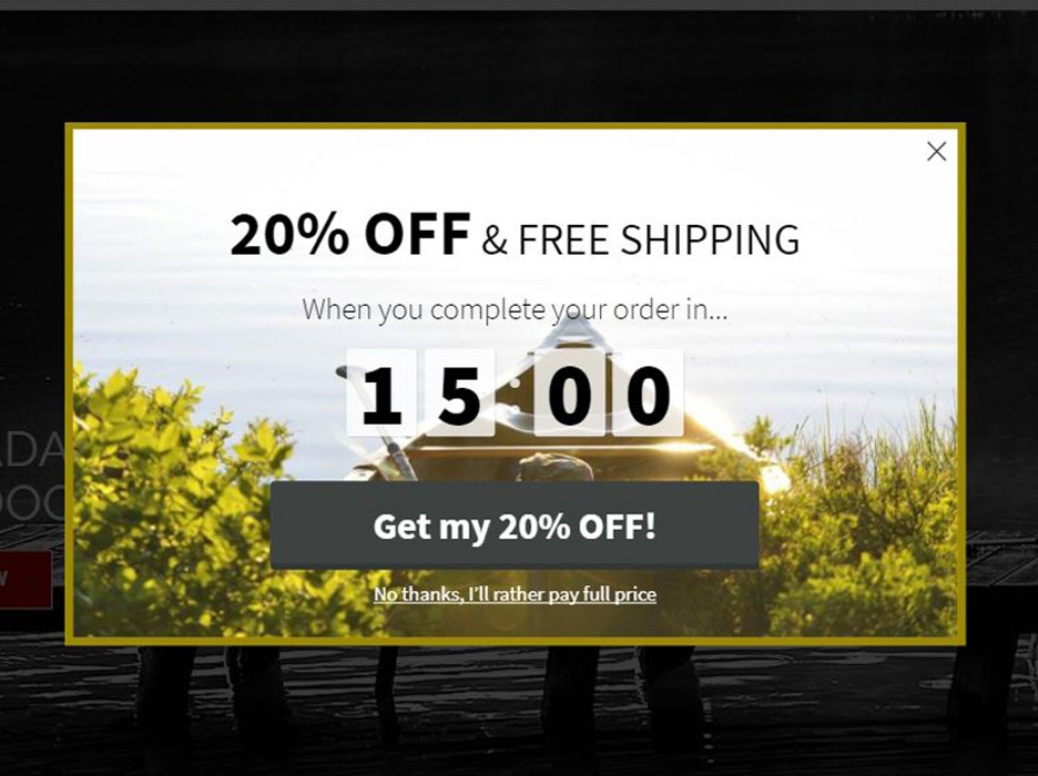
What this popup does well:
- Again, a countdown timer is a fantastic way to generate urgency and action.
- Simplicity. The popup manages to present multiple offers (free shipping and a discount) without overwhelming visitors.
- It has a great message to reduce cart abandonment and prevent skeptical shoppers from bouncing.
What could be optimized or A/B tested:
- The offer needs an A/B test to calculate the ideal value for the deal.
- The countdown timer details could pop a bit more with larger text or a contrasting color scheme.
- The same goes for the call-to-action button. A contrasting color could make it stand out more.
3. Oka.com
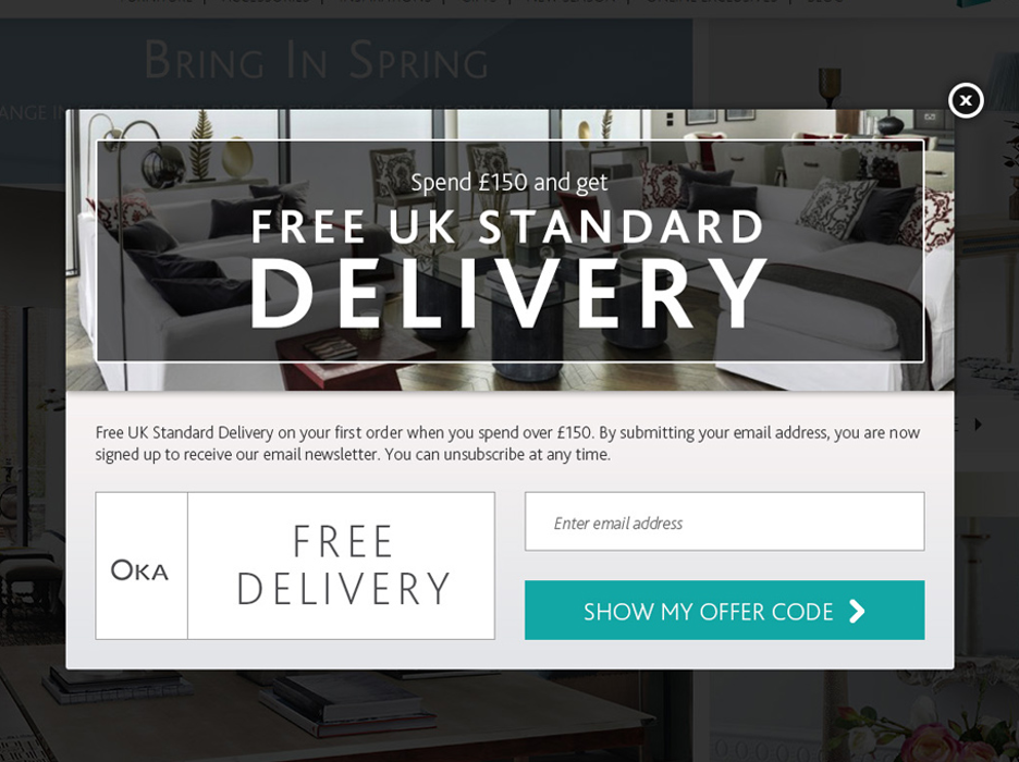
What this popup does well:
- The offer is based on order value. It appeals to customers who are looking for that free shipping threshold.
- The popup presents a personalized experience by appearing to customers from specific countries via geotargeting.
- It has an upfront, honest message about their email list opt-in (“…You can unsubscribe at any time”).
- The CTA button contrasts well with the popup copy.
What could be optimized or A/B tested:
- They could improve readability by changing the background image.
- The popup would be more striking if they used a simpler layout.
If you’d like to promote free shipping on your discount popup, get started with one of these templates:
Discount code and coupon code popups
92% of shoppers in the US scout for coupons before making purchases. Offering discounts and coupons is a proven method for driving sales. That’s why they’re perfect for your popups.
Let’s check out some examples below.
4. Jonquil.com.au
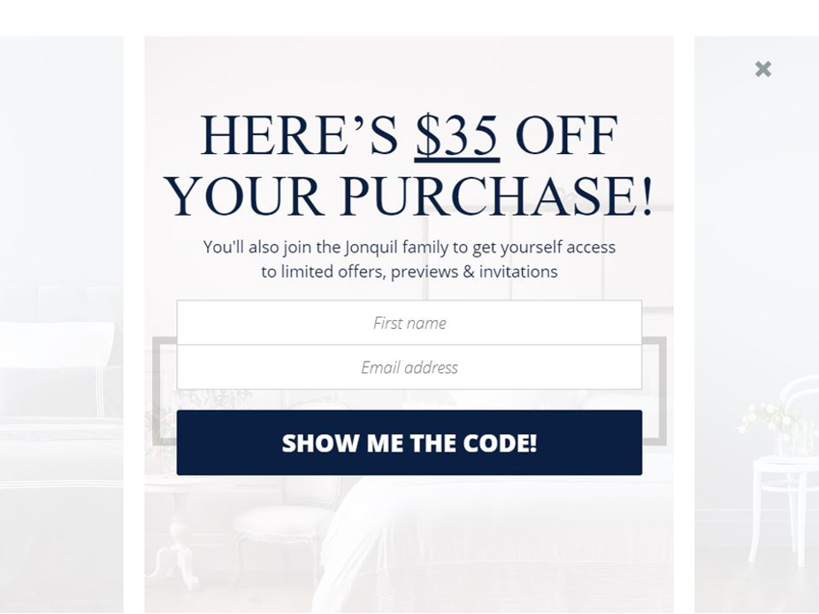
What this popup does well:
- It’s a tasteful fullscreen message. It’s on point with their brand and site design.
- It works to get email subscribers while simultaneously encouraging website visitors to convert.
- It has welcoming copy (“join the . . . family”) and unique CTA text.
What could be optimized or A/B tested:
- There are several different fonts being used on the popup, which could be visually overwhelming for visitors. It’s worth A/B testing whether using the same font from the CTA for the title works better.
- The form could also be A/B tested (a single field vs. the two fields). Although some visitors are happy to fill out more fields in pursuit of a deal, others may bounce. You won’t know until you test for yourself!
5. ProspectorKnives.com
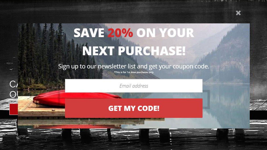
What this popup does well:
- It simultaneously builds the subscriber list and encourages future orders with a discount code.
- The selling proposition is crystal clear.
- Great use of color in both the CTA and the percentage discount (20%) in the offer.
What could be optimized or A/B tested:
- Extending the signup form with a name field to allow for personalization.
- The background image is too busy and could take the visitor’s attention off the offer. Consider how intense the image is and whether it might overwhelm your visitors.
6. Zooji.com
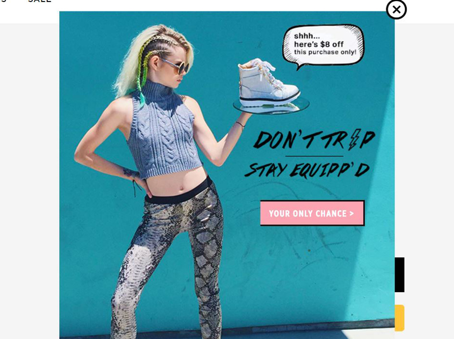
What this popup does well:
- It has a unique, colorful design (perhaps the most stylish of our discount popup examples).
- The image naturally leads the eye toward the offer itself.
- It captures the brand’s tone and voice.
What could be optimized or A/B tested:
- The button could be larger or contrast more with the background color.
- Additional features such as countdown timers could help decrease cart abandonment.
7. CharmsToTreasure.com
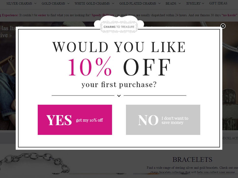
What this popup does well:
- It’s a two-step popup: the signup form appears once visitors have already shown interest by clicking “YES.”
- It effectively uses a question in the title, which is more engaging than a simple statement.
- Excellent color choices to highlight the offer and CTA.
- The subtle arrow adds style and draws visitors’ eyes to the CTA button.
What could be optimized or A/B tested:
- A sticky bar could appear after someone fills out the form to remind them about the offer.
- “10% OFF” could be as bold as the “YES” text.
8. MyKinin.com
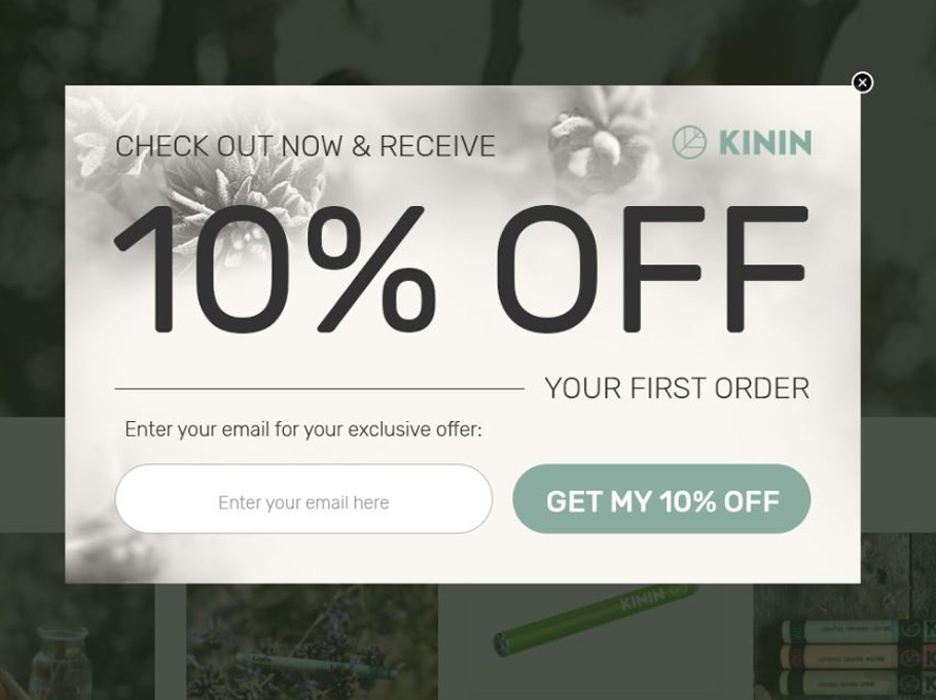
What this popup does well:
- Great design: stylish font and color choices.
- It makes a straightforward offer to new customers (hint: your popup discount doesn’t have to be rocket science).
- The offer is large and grabs attention.
- With a single field to fill out, it doesn’t require much effort on the part of the visitor.
What could be optimized or A/B tested:
- A name field could be added to allow for personalization.
- The type of discount could be A/B tested: a flat dollar amount compared to a percentage discount.
9. CellPhoneCenter.com
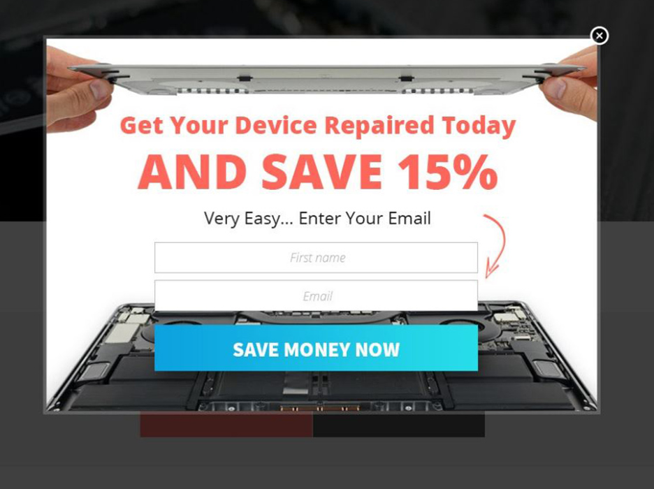
What this popup does well:
- Bright, complimentary color choices (including the red arrow which draws eyes down to the CTA).
- The CTA button text creates a subtle sense of urgency.
- Great use of “power words” throughout the copy (Today, Save, Easy, Now).
What could be optimized or A/B tested:
- All of the popup text could be uppercase for the sake of consistency and grabbing visitors’ attention.
- A variant without a background picture could drive more attention to the special offer.
10. PurePetFood.co.uk
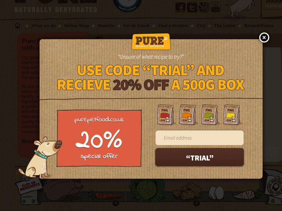
What this popup does well:
- It has a brilliant, playful design.
- It does double-duty of building the email subscriber list while encouraging shoppers to buy.
- Unique offer: this popup allows visitors to order a trial product with a discount, which can lead to future orders.
What could be optimized or A/B tested:
- The “20% OFF” text and the “TRIAL” button could be more vivid.
- It’s not clear how to use the code: “Should I use the coupon code at checkout or not?”
- The coupon code is displayed before signing up. This could ultimately hurt the conversion rate and performance of the popup if visitors are redeeming the code without opting in.
11. Natural-Fertility-Info.com
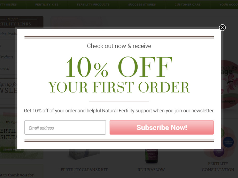
What this popup does well:
- It looks modern and clean.
- The CTA button stands out and has a clear message.
- The simplicity of the single-field opt-in is great for collecting email addresses.
What could be optimized or A/B tested:
- The call-to-action button and text could pop more: brighter colors and a bolder typeface would be a good starting point.
- Consider adding a “Name” field to allow for personalization.
- The first line of text could be uppercase for consistency.
12. Pond5.com
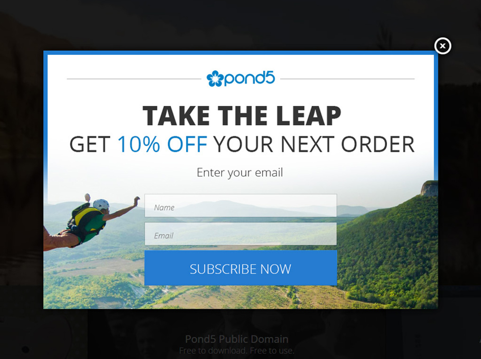
What this popup does well:
- Bright, modern design with great colors and fonts.
- The company logo fits nicely in the design.
- The CTA button is clear and bold.
What could be optimized or A/B tested:
- The button text could be stylized with a custom call-to-action phrase instead of “SUBSCRIBE NOW.”
- The popup could work well as a fullscreen message.
- Removing the background picture could draw more attention to the offer.
If you want to offer discounts and coupons, here are a few templates that can get you started:
Limited-time discounts
Popup promotions centered around urgency and scarcity are popular for a reason! They encourage immediate action and make your offer feel like it’s too good to miss.
Coupled with the right offer and creative elements, these are among the best popups for sales promotion.
13. MMAWarehouse.com
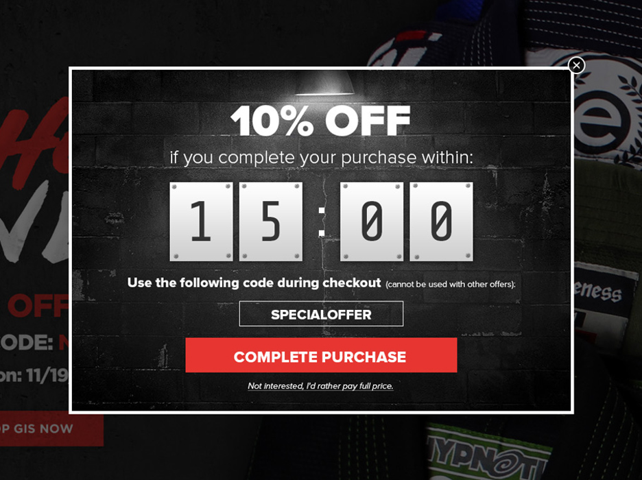
What this popup does well:
- Striking design that matches the website’s branding.
- The countdown timer creates urgency.
- Excellent color choice for the CTA button. The pop of red makes visitors want to click it.
What could be optimized or A/B tested:
- The coupon code should only be visible after the customer has clicked on the button (to accurately measure conversions).
- They could A/B test a slightly different background color to make their offer stand out more.
14. SoggyDoggyDoormat.com
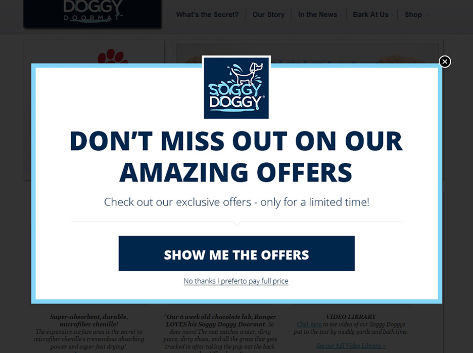
What this popup does well:
- Ensures that visitors only see the best offers in the store.
- Their limited-time offer creates FOMO.
- Simple, clean design (the light and dark contrast makes it easy to read).
What could be optimized or A/B tested:
- The CTA button color could stand out more.
- The text could hint at the benefits or specifics of the offers to increase curiosity and clicks.
15. TapestryGirls.com
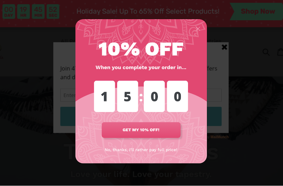
What this popup does well:
- The bright color scheme forces visitors to pay attention to the offer.
- Their bold offer is easy to understand.
- The countdown timer nudges visitors to act ASAP.
What could be optimized or A/B tested:
- The opt-out text could be more legible.
Check out how Tapestry Girls saw a 50% increase in conversions with OptiMonk.
If you want to use limited-time discount popups, these templates might be perfect for you:
Seasonal campaigns & Black Friday popups
It’s no secret that holiday ecommerce is booming as consumers flock to Black Friday, Cyber Monday, and other seasonal sales. Holidays represent an ideal time to run sales promotion popups, and they represent a massive opportunity to boost sales for any ecommerce site.
Check out these seasonal discount popups below.
16. EasyologyPets.com
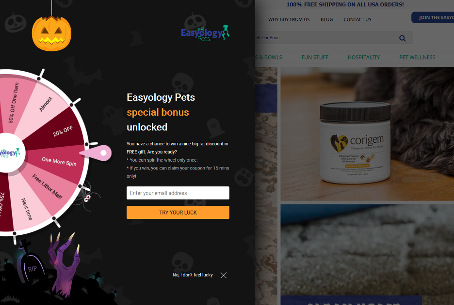
What this popup does well:
- It’s a spin-the-wheel popup with a seasonal look. Popups like these, which incorporate games of chance, can be irresistible.
- It provides multiple promotions for everyone’s needs (and prevents customers from combining them).
- It’s playful and fun, and doesn’t feel like a traditional promo.
What could be optimized or A/B tested:
- The color of the CTA button could be A/B tested.
- They could experiment with the size and positioning of the copy.
- The company logo at the top of the popup is hard to see against the dark background color. They could try alternative background colors or place the logo differently so it’s more visible.
17. Beddingstock.com
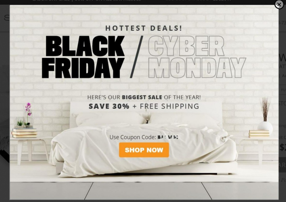
What this popup does well:
- The Black Friday/Cyber Monday promotion makes the popup time sensitive.
- The CTA stands out wonderfully by using a contrasting color.
- The copy highlights the importance and value of the deal (“BIGGEST SALE OF THE YEAR”).
What could be optimized or A/B tested:
- They could try a multi-step popup with a code reveal.
Check out these seasonal sales promotion popups and create your own in just a few minutes:
Product recommendation popups
Product recommendations account for approximately 33% of ecommerce sales, which means using product recommendation popups can be a really smart move!
You can customize your “suggested item” popups based on your visitor’s browsing behavior, or you can promote your best-selling products.
Let’s check out some product recommendation popups below.
18. Photopaperdirect.com
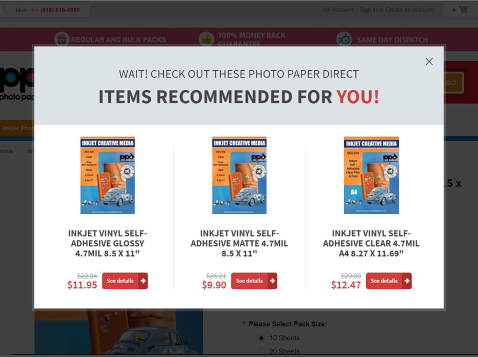
What this popup does well:
- Intelligent product recommendations are an excellent personalization technique.
- It offers three relevant products to the customer, creating a sense of choice without triggering analysis paralysis.
- The attention-grabbing header text hooks more visitors.
What could be optimized or A/B tested:
- The headline’s color should contrast more to stand out from the background.
- They could A/B test the value of the discount to maximize engagement—for example, does 25% or 50% off versus a flat dollar amount of $10 or $15 off perform better?
19. TinyBeastDesigns.com
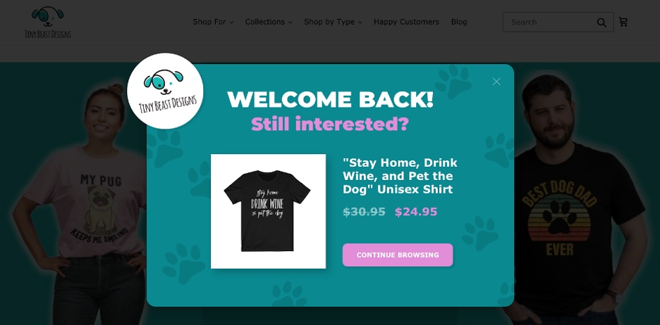
What this popup does well:
- It uses a vibrant, on-brand color scheme.
- It recommends a specific product, making the popup seem more personal.
- The tone is clear, welcoming, and helpful.
What could be optimized or A/B tested:
- The product thumbnail could be larger and clearer. They could experiment with popup and image sizing.
- They could make the X button easier to find with a circle around it or a more noticeable color.
Read more about how Tiny Beast Designs collected 2,200+ sign-ups for their new store using OptiMonk.
Try these product recommendation popup templates:
How to make a discount popup in 6 steps?
Now that we know what a discount popup is and we’ve seen some amazing examples, let’s go over the steps you can use to make your own with OptiMonk’s powerful popup tool!
Step 1: Plan your offer
There are a few important questions you need to answer before starting to create your popup. These include:
- What’s your offer? Is it a percentage discount, BOGO, or a specific dollar amount?
- Who do you want to target with your offer? New customers? Returning customers? Only cart abandoners? Traffic from a specific source?
- How long will you run your promotional offers? A few hours? A few days? Will they be tied to a holiday?
Generally, you want to run popup campaigns that deliver relevant offers to well-defined segments of customers. That way, you know that your visitors will be interested in your coupon popups.
Step 2: Design your coupon popup
You’ve figured out your offer and defined your target audience. It’s time to create your popup!
If you have the resources, you can always design your popup from scratch. But if you’re short on time or don’t have an in-house designer, you can use a pre-built template to create your discount popup.
The OptiMonk Template Library contains more than 300 templates that you can filter by goal and message type.
Here are just a few of the templates for discount popups that we have available:
Once you’ve found the perfect template, you can easily customize it with OptiMonk’s intuitive drag & drop editor.
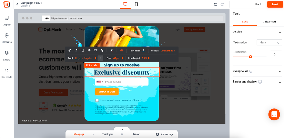
The most important edits you’ll want to make are to the copy. Add in the details of your discount code offer and choose a catchy headline that fits with the tone of the rest of your website. But you can also add new elements, customize colors and fonts, and make many other changes to the design of your popup in just a few clicks.
Recommended reading: Ultimate Guide to Best Popup Design: Popup Examples & Best Practices
Step 3: Set up your coupon code
While designing your coupon popup, don’t forget about the “thank you” message, which is where you’ll display the coupon code.
In OptiMonk, you have lots of options. You could choose to use a generic coupon code, like “10OFF,” to display on all the discount coupons.
You could also opt to provide unique coupon codes to your visitors by uploading coupon codes into OptiMonk. This will guarantee that each visitor gets a unique discount code, which helps you track the success of your promotional popups.
To use this feature, select “Unique” under General>Discount code type in the Coupon Code Element settings:
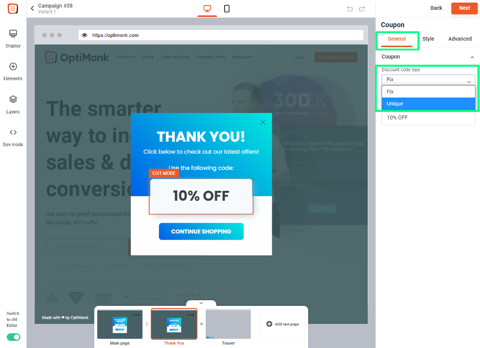
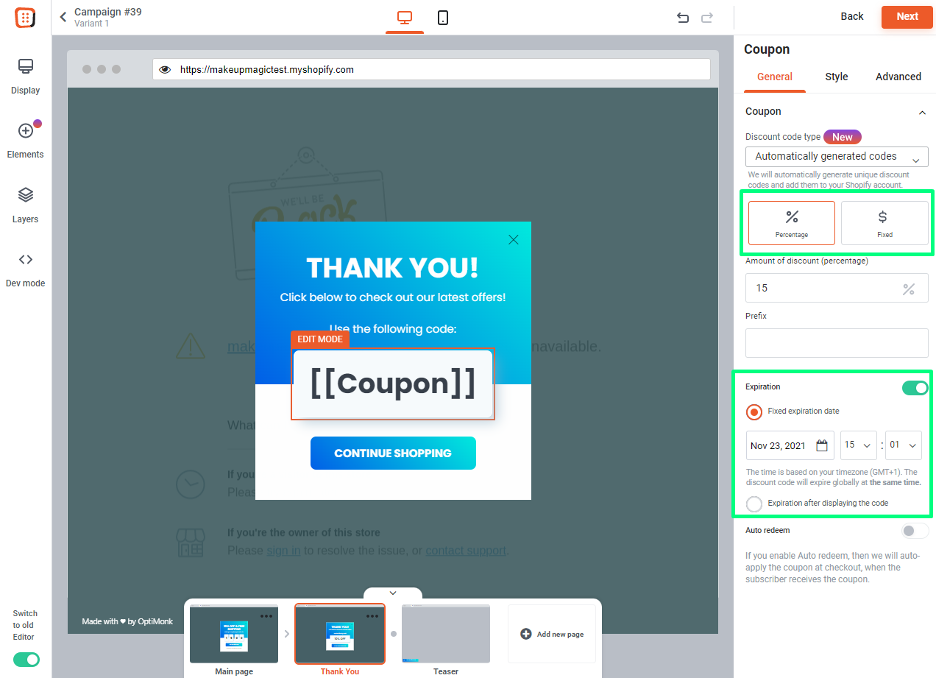
If you have a Shopify store, you can also use OptiMonk to create automatically generated coupon codes. This will create unique coupon codes for every one of your visitors.
You’ll be able to select a fixed discount or a percentage, and you’ll also be able to set an expiration date for your coupon codes.
Recommended reading: 12 tactics to make discounts work better
Step 4: Set your targeting options
OptiMonk has a wide variety of triggering and targeting options. The right settings for your campaign depend on who you’re targeting with your offer.
Let’s go over triggering first, which determines when your popup will appear.
If you want to decrease cart abandonment, you’ll want to use exit intent as a trigger. And if you want to target returning customers, you might want to use a time-based trigger (after X seconds).
But you have lots of other triggering options in OptiMonk:
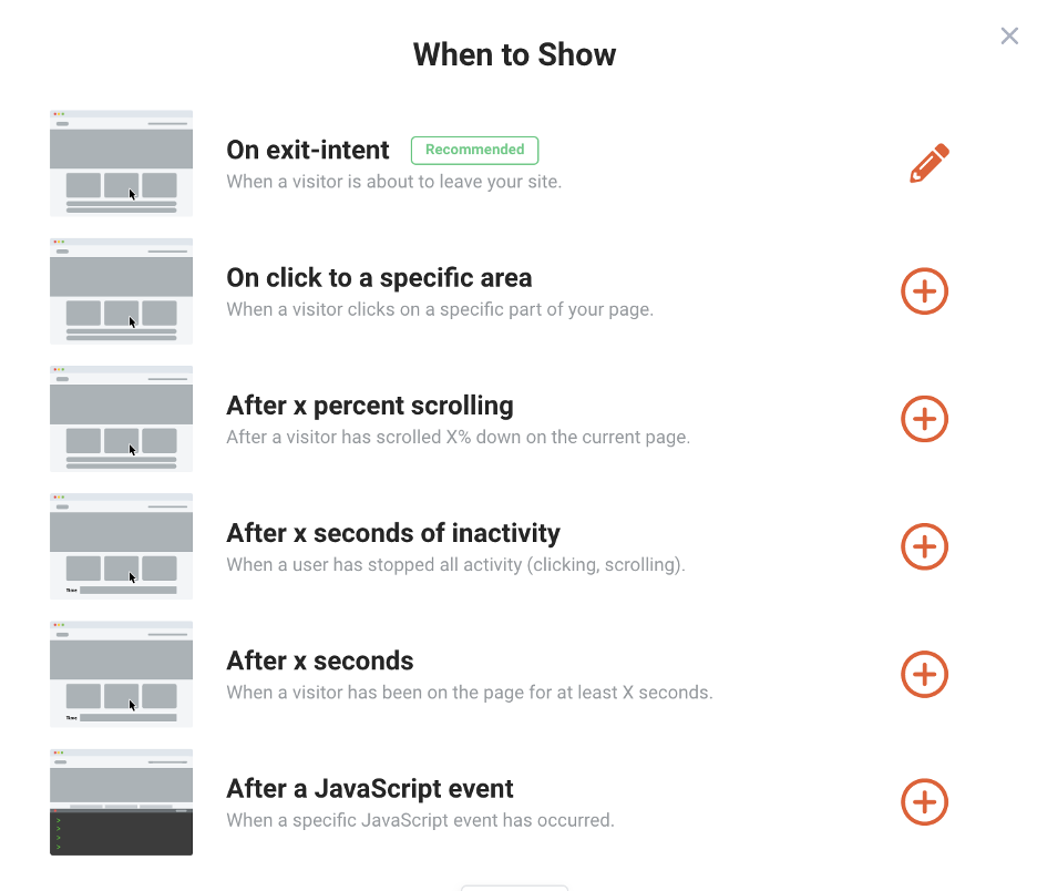
After you set up the trigger, it’s time to set the targeting rules for your popup, which determine who will see your popup.
You shouldn’t show the same popup to each visitor, and targeting options help you to create different segments and target them with different messages.
Using OptiMonk, you can target people based on many factors, including:
- Returning or new visitor
- Traffic source
- Country
- Subscriber or non-subscriber
- Cart content
- URL(s) visited
Recommended reading: Top 9 Ecommerce Segments & How to Help Them With Popups
Step 5: Connect it to your email marketing tool
If you have an email field in your coupon code popup, don’t forget to connect it with your email marketing tool. This way, all the details you collect over the course of your coupon promotion popup campaign will be automatically sent over.
OptiMonk seamlessly integrates with some of today’s most popular email service providers, including Klaviyo, Mailchimp, ActiveCampaign, GetResponse, and more.
Check out all OptiMonk’s integrations here!
Step 6: Activate your coupon popup
And finally, when you’re ready to make your campaign live, all you need to do is activate it. You can either launch your campaign immediately or schedule it for the future. That’s it!

6 bonus tips for displaying discount popups (without annoying your visitors)
To wrap things up, let’s review some of our popup design best practices and the things you’ll want to keep in mind before you roll out discount popups for your online store.
1. Trigger popups based on visitor behavior
Think about the user experience when it comes to presenting your discount codes. Rather than triggering your popup immediately as soon as someone lands on your site, give new visitors some time to breathe and browse.
You don’t want to interrupt those critical first seconds or scare anyone away, right?
This speaks to the importance of behaviorally triggered popups, which are shown based on pre-set criteria that you choose.
For example, you can choose to trigger popups based on how long someone spends on your site or how far they scrolled down on a page. You can even trigger your discount popup to appear when someone is about to leave your site.
This ensures that your popups are seen by the right prospects at the right time, improving the chances they’ll convert.
2. Personalize your popup message
When it comes to discount popups, relevancy is extremely important. You can’t target top-of-funnel visitors who are just browsing a blog with discount codes that expire in 15 minutes.
Make sure to present your discount code to online shoppers who are ready to make a purchase and just need a final nudge.
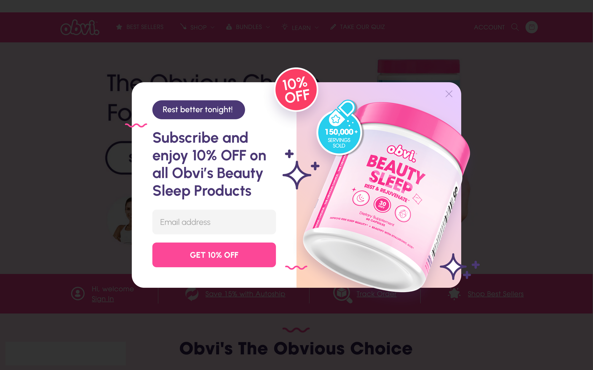
Another way to make your popups more relevant is by personalizing the messaging, as it works brilliantly. This can be done based on many factors, like interest:
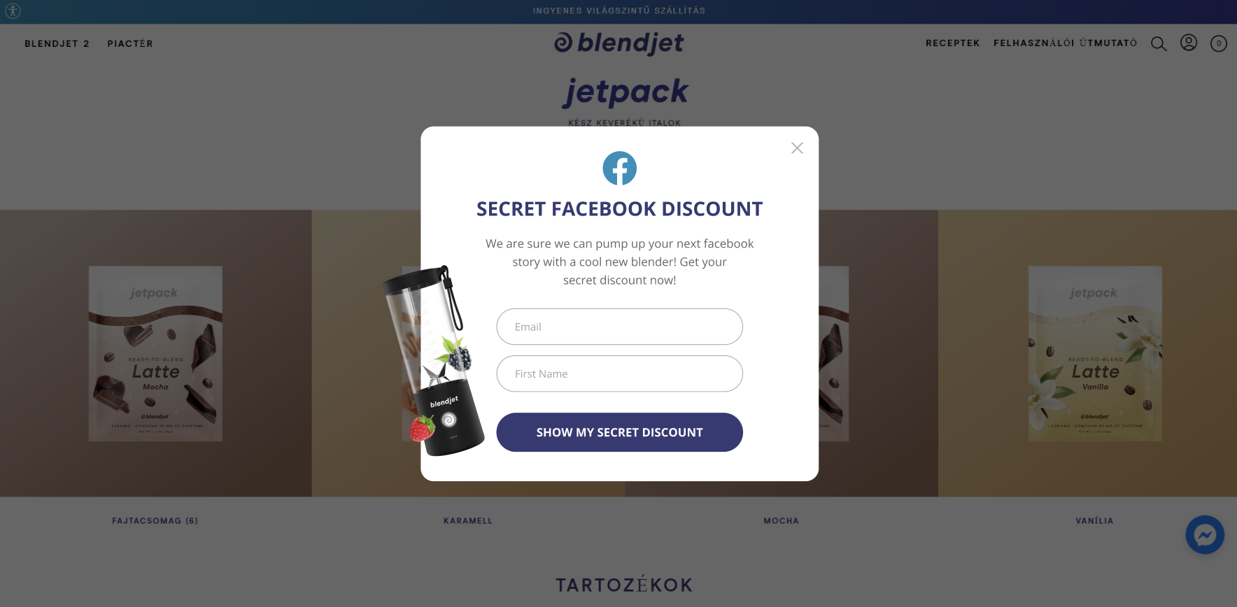
You can also personalize your sales promotion popup based on traffic source:
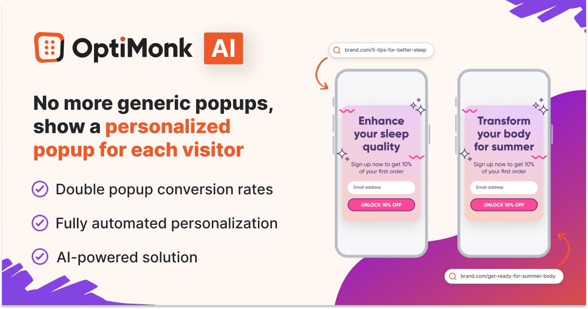
For a seamless and efficient approach to personalized popups, consider integrating OptiMonk’s AI-powered Smart Popups tool into your strategy.
This solution goes beyond manual customization, automatically tailoring the messaging of your popups to each visitor’s unique interests.
This means no more manual work and a significant reduction in the time and effort traditionally associated with crafting personalized content.
3. Use gamification to make your discount popups feel less “salesy”
Simply put, we’re a big fan of gamified popups here at OptiMonk (see example #16 above).
Why? Gamified popups don’t feel like sales messages. They’re a playful way to engage with visitors while also encouraging them to make a purchase.
If nothing else, gamified popups are fun and out of the ordinary. This is a stark contrast to all the brands that don’t put much thought into their promotions.
4. Keep your popup design and copy as simple as possible
A common thread among many of the best popups is that they’re not too complicated. Remember, your popups should be easy to understand at a glance.
That means:
- Use simple language and separate your message into brief, punchy statements instead of sentences or paragraphs.
- Remove unnecessary images or anything that could distract visitors.
- Create a clear CTA button that grabs attention.
- Add a noticeable X button so your shopper can leave the popup when they want to without getting frustrated.
5. Avoid overwhelming visitors with too many form fields
We get it: you want to collect as much information on your leads and prospects as possible. But asking for too much can hurt your chances of winning a customer.
Consider this: most people are shopping on their mobile devices. They don’t have as much time (or as comfortable a keyboard) as when they’re browsing on their computers at home.
There’s a reason why most discount popups simply ask for names and email addresses: fewer form fields are easier on your visitors and more likely to result in opt-ins.
6. Make sure your popup design matches your brand and website
Any sales popup on your site needs to match the branding on your site. This includes your logo, color scheme, terminology, and brand voice.
Popups should feel like a seamless part of your website, not an in-your-face interruption.
Thankfully, putting together stylish, branded popups can be a cinch thanks to tools like OptiMonk.
You can adapt your discount popups based on your unique branding and messaging in no time. Start by browsing our Template Library with hundreds of templates to choose from, then customize to match your brand!
Wrapping up
Popup promotions are a powerful way for ecommerce brands to drive sales and build brand loyalty.
Hopefully, the discount popup examples in this article have inspired you to create your own so you can start scoring more sales!
If you haven’t already, make sure to try out the many popup customization features offered by OptiMonk. It’s easy to use and integrates easily into your ecommerce site. You’d be surprised at just how quickly you can get your next sales promotion campaign up and running.
Create a free account today and follow the examples above!
Learn more
Would you like to see more popup examples? Check out these articles:
Migration has never been easier
We made switching a no-brainer with our free, white-glove onboarding service so you can get started in the blink of an eye.
What should you do next?
Thanks for reading till the end. Here are 4 ways we can help you grow your business:
Boost conversions with proven use cases
Explore our Use Case Library, filled with actionable personalization examples and step-by-step guides to unlock your website's full potential. Check out Use Case Library
Create a free OptiMonk account
Create a free OptiMonk account and easily get started with popups and conversion rate optimization. Get OptiMonk free
Get advice from a CRO expert
Schedule a personalized discovery call with one of our experts to explore how OptiMonk can help you grow your business. Book a demo
Join our weekly newsletter
Real CRO insights & marketing tips. No fluff. Straight to your inbox. Subscribe now
Nikolett Lorincz
- Posted in
- Conversion
Partner with us
- © OptiMonk. All rights reserved!
- Terms of Use
- Privacy Policy
- Cookie Policy
Product updates: January Release 2025

