- Blog
- 11 Popup Message Examples & Tips on How to Create the Perfect Popup Message
11 Popup Message Examples & Tips on How to Create the Perfect Popup Message
-
Nikolett Lorincz
- Conversion
- 6 min read
Table of Contents
Did you know that popup messages can be your secret weapon to boost conversions, generate leads, and enhance customer engagement?
In this article, we’ll guide you through the process of creating the perfect popup message. We’ll also explore various real-world popup message examples that work and discuss how to measure their success.
Let’s get right into it!
What are popup messages and why do they matter?
Popup messages are attention-grabbing overlay notifications that appear on websites.
They come in different forms, like lightbox popups, slide-in popups, welcome mats, gamified popups and fullscreen messages. They’re designed to motivate users and drive conversions.
Here are just a few examples of the amazing benefits of creating popups:
- Growing your newsletter list,
- Increasing pageviews,
- Attracting more leads,
- Decreasing cart abandonment,
- Gathering feedback,
- Encouraging sales,
- And much more.
By understanding the power of popups and learning how to create the perfect pop-up message, ecommerce store owners can significantly improve marketing results and better connect with their audience.
How to create an effective popup message?
To make sure your popup notification is effective, mastering three fundamental elements is crucial. Every popup should be created with the following principles in mind:
1. Context
Aligning your message with the content of your webpage is important. However, you don’t want to repeat the primary message from your webpage exactly, since visitors are already acquainted with that proposition.
Instead, try presenting a secondary offer.
For instance, if your webpage highlights a 10% discount on a specific product category, a redundant popup stating the same offer isn’t advisable. Rather, you should leverage popups to show a “backup offer.” Consider presenting alternative product recommendations or try capturing email addresses.
2. Design
Effective design is critical when it comes to pop-ups. Your layout should be visually appealing, your text should be easy to read, and the look and feel of the popup should align with your brand identity. Color, typography, imagery, white space, and grid structure are all essential elements of a successfully designed popup.
To create an effective design and layout for your popup notification, use a consistent color palette, select a readable font, and include high-quality images.
Recommended reading: Ultimate Guide to Best Popup Design: Popup Examples & Best Practices
3. Targeting and triggering
You’ll need to select appropriate targeting and triggering options to guarantee that your popup notification is displayed at the right time to the right people, aligning with the interests of your target audience (based on user behavior or specific conditions).
There are different types of triggers you can use to display a popup notification, like:
- Exit intent
- Time spent on site
- Clicking a link or button
- Scrolling down the page
Great examples of targeting rules include location, device type, and past interactions with the site.
To help you create effective messages, consider using tools like OptiMonk, which offer powerful targeting and triggering options for both desktop and mobile users.
11 great examples of popup messages that work
Now that you know about the fundamental elements of a good popup, let’s see them in action with some real-life examples of successful popups!
By analyzing these examples and understanding the reasons behind their success, you can learn valuable lessons and apply the principles to your own popup message strategy.
1. Braxley Bands’ exit-intent popup
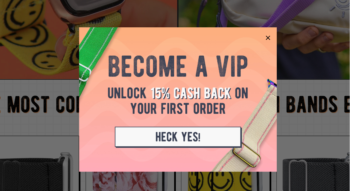
Braxley Bands’ eye-catching popup aims to retain users who are about to leave the site, offering an incentive to keep them engaged. This is a great way to recover abandoning visitors.
The copy sparks intrigue, promising an irresistible “15% cash back on your first order” as a token of appreciation.
The popup has captivating colors and a layout that seamlessly integrates with the overall aesthetic of the brand. It not only adds a touch of vibrancy but also offers a compelling reason for visitors to reconsider their decision to exit.
2. Blume’s welcome popup
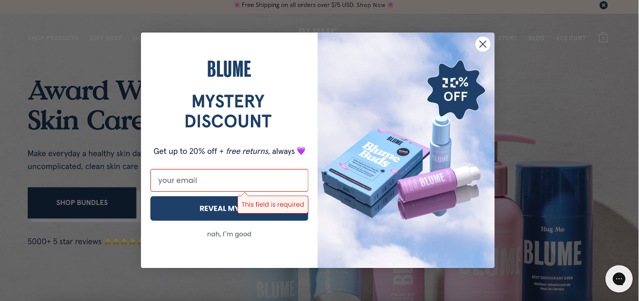
Blume’s popup is a great example of crafting an unforgettable welcome experience for new website visitors.
It greets them and offers a special deal encouraging them to subscribe to their newsletter. The visuals and message harmonize, creating a great user experience.
But here’s the real magic: they offer a mystery discount. Based on our experience, mystery discounts convert much better than a simple 10% off because they spark curiosity.
3. Pulp Pantry’s email newsletter popup
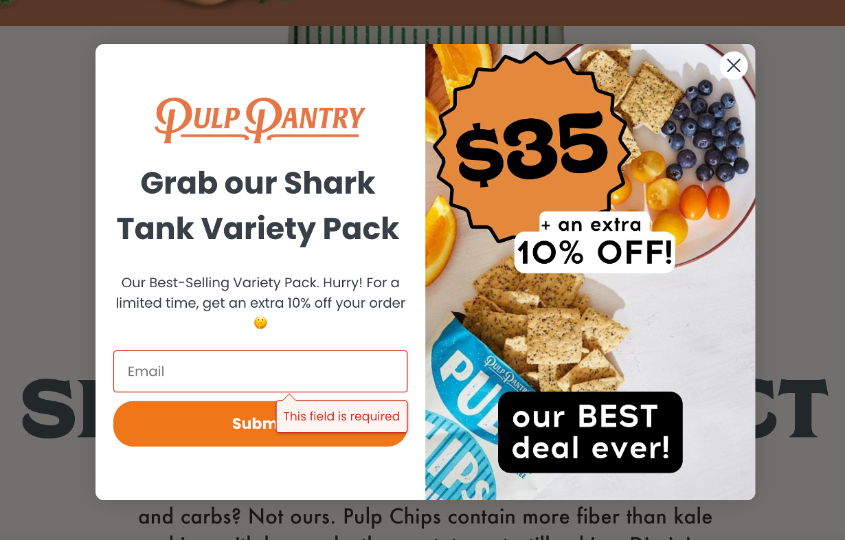
Here’s another standout example of an effective popup message from Pulp Pantry. With a blend of captivating imagery, persuasive copy, and an irresistible offer, Pulp Pantry’s popup has all the elements to entice visitors to join their mailing list.
The copy itself, “Grab our Shark Tank Variety Pack,” not only sparks interest but also leverages the power of social proof, bolstering the brand’s credibility.
The addition of “Hurry! For a limited time” injects a sense of urgency, compelling users to take immediate action.
And the cherry on top is the extra 10% discount, which acts as the final nudge, ensuring a higher likelihood of conversion.
4. Vegetology’s mystery discount popup
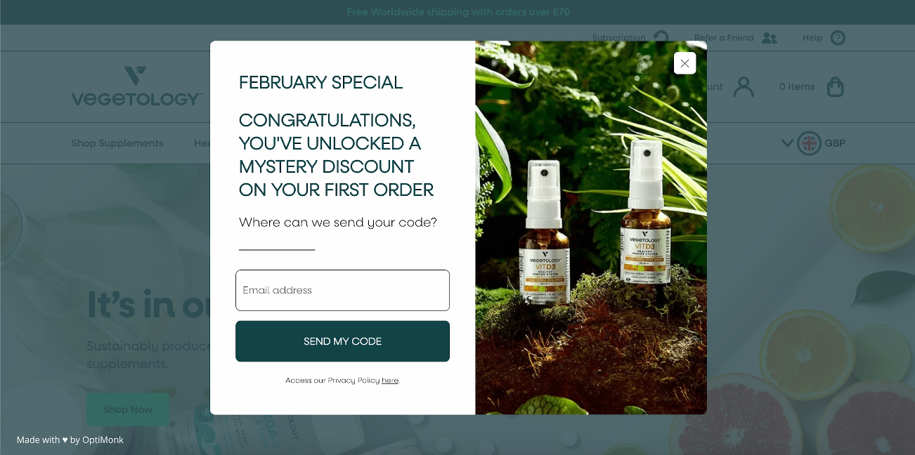
Vegetology’s discount popup offers users a mystery discount, incentivizing them to make a purchase. This popup not only helps to grow their email list but also increases sales.
By offering a limited-time discount (notice “February special” in the headline), they increase urgency. This adds an extra layer of motivation, compelling visitors to act swiftly before the opportunity expires.
Vegetology’s mystery discount popup presents a compelling blueprint for businesses seeking to captivate their audience and foster lasting customer relationships.
Recommended reading: How Vegetology Boosted Its Email Signups and Ecommerce Conversions Through Personalization
5. Yellow Beauty’s sidemessage popup
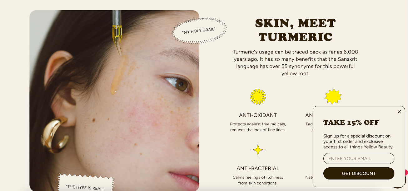
Yellow Beauty’s sidemessage brilliantly delivers an irresistible incentive without a trace of annoyance. It seamlessly blends into the website’s aesthetic and pops up discreetly on the side, so it doesn’t disturb the user experience.
The strategic promotion of a 15% discount on the first order serves as a powerful catalyst, luring visitors to take the plunge and become valued customers.
6. Joggy’s sidemessage popup
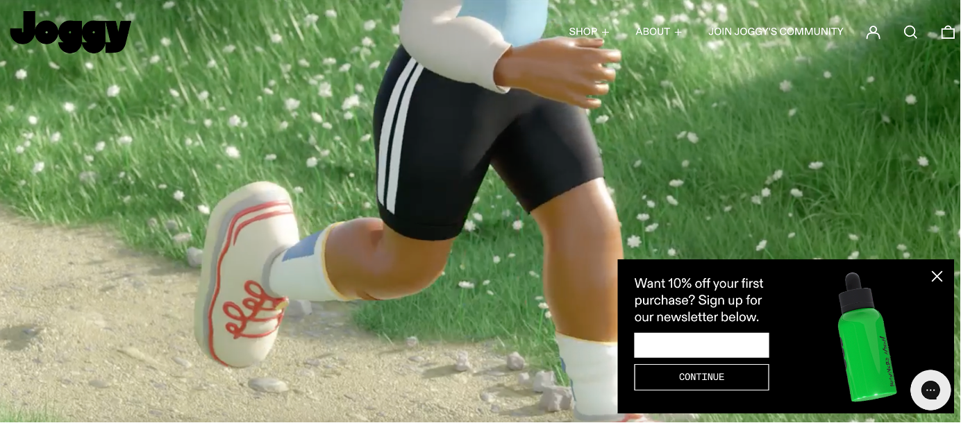
Joggy’s savvy use of a sidemessage popup underscores the art of unobtrusive yet compelling user engagement.
They use a high-contrast color combo (black, white, and green), which not only grabs attention but also underscores the brand’s dynamic identity.
Through this subtle yet impactful design choice, Joggy creates a visual focal point that invites users to explore the value proposition further.
7. Three Ships Beauty’s multi-step popup
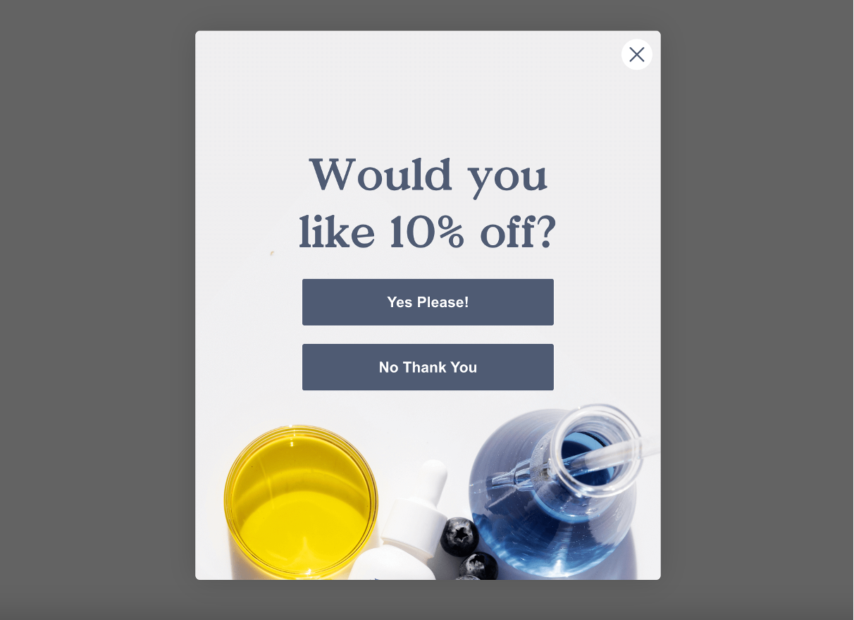
Three Ships Beauty’s multi-step popup example shows exactly how to capture audience interest.
They start with a question, “Would you like 10% off?” and two potential answers, piquing curiosity and encouraging active participation. This two-tiered approach gauges interest and offers users a sense of autonomy.
Once the user selects “yes,” the journey seamlessly progresses to the second page, where the user providers their email address in exchange for the promised 10% discount.
8. G FUEL’s email popup
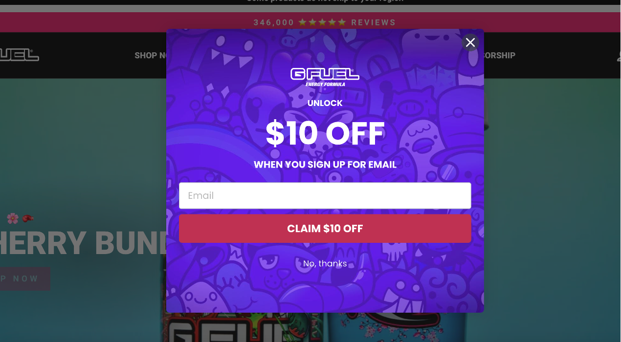
G FUEL’s email popup has a straightforward yet enticing offer of $10 off upon email sign-up.
The use of clear, concise copy eliminates any confusion and allows users to swiftly grasp the benefit and decide whether they’re interested.
The popup’s captivating design grabs attention and ensures that visitors consider the offer.
9. Diaspora Co.’s email popup
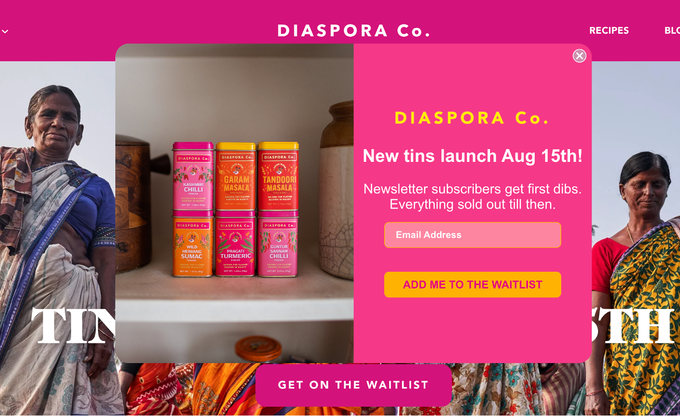
Diaspora Co’s email popup encapsulates the essence of urgency, excitement, and value.
They offer a sneak peek into their upcoming product launch and position newsletter subscribers as privileged insiders who “get first dibs.” This effectively cultivates a sense of community and exclusivity, which is very appealing.
10. Nexus Nutrition’s popup notification
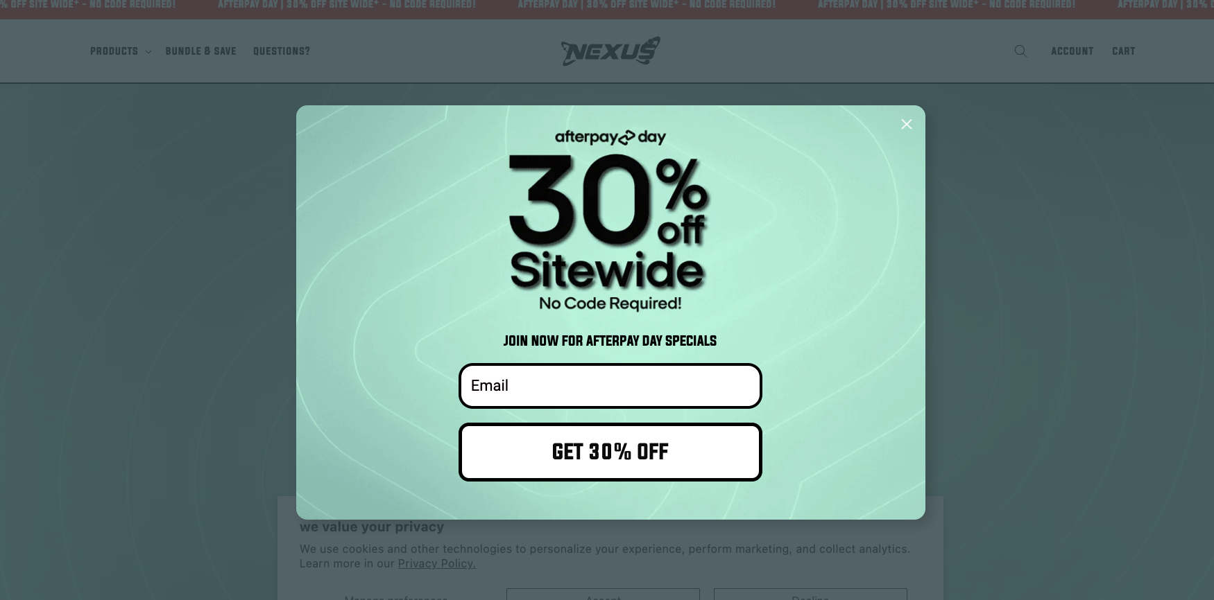
Nexus Nutrition’s popup window captures attention with a clear and straightforward message offering 30% off sitewide with no promo code required.
This popup stands out among our popup message examples by making the process seamless for the user—no need to memorize or apply discount codes at checkout. All that’s required is for the visitor to enter their email address, making it a simple yet effective strategy to grow their email list while incentivizing immediate purchases.
11. Desert Does It discount popup message
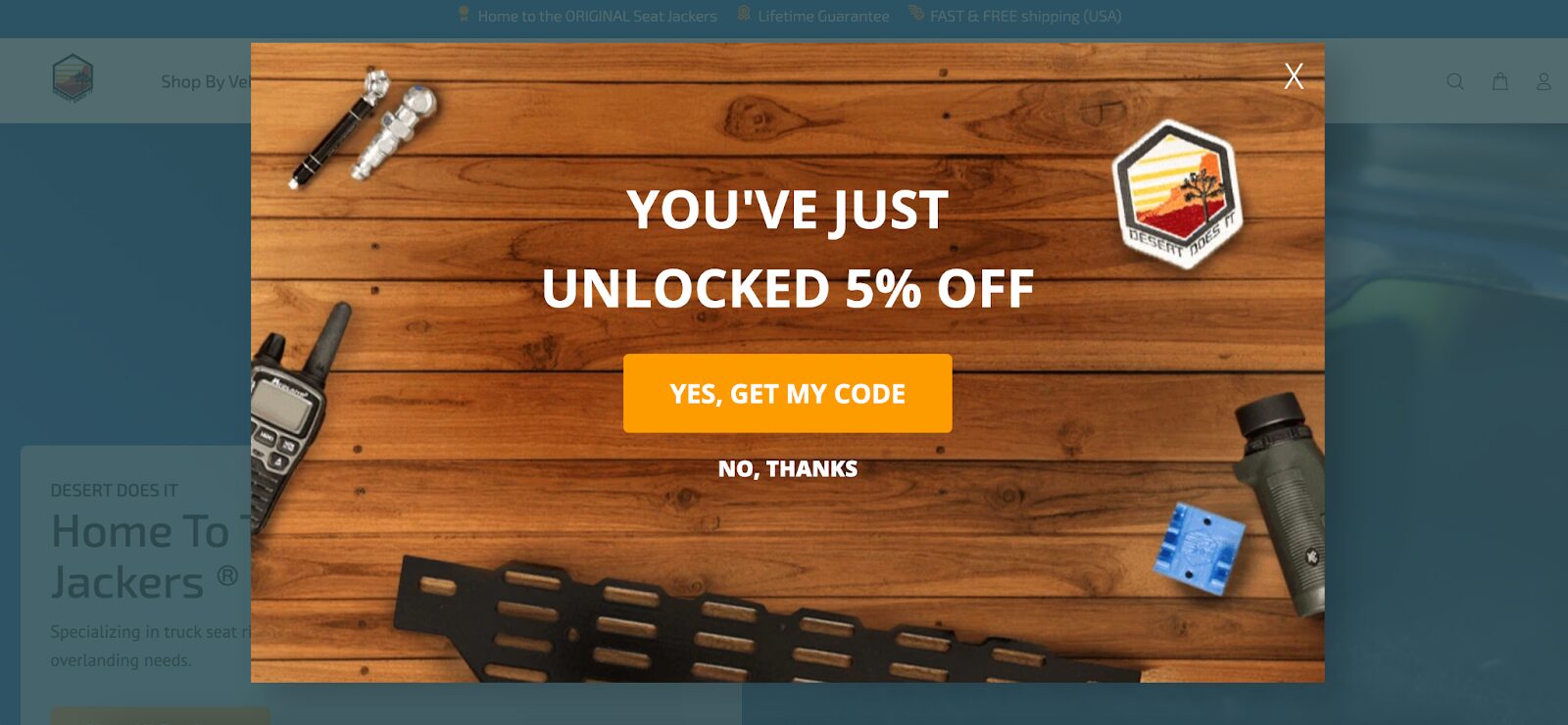
Desert Does It employs a highly engaging multi-step popup that offers a 5% discount to site visitors.
The first page of the popup features a yes-no question to capture user interest without being too intrusive. After a user clicks “Yes,” the popup progresses to ask a few targeted questions, helping the brand collect valuable zero-party data—information customers willingly share.
After gathering these insights, the popup prompts users to enter their email address, making the entire process feel conversational and personalized.
Recommended reading: The Ultimate Guide to Creating High-Converting Popups
How to measure the success of your popup message
Measuring the success of your popup message involves tracking key performance indicators (KPIs) such as impressions, number of conversions, and conversion rates.
By monitoring these metrics, you can evaluate the performance of your popup messages and identify areas for improvement.
But if you’d like to track the real success of your popups, you need to go beyond popup conversion rates. By tracking goals like purchases, you’ll be able to measure campaign success more accurately, optimize campaigns using more precise data, and ultimately improve your website’s overall performance.
OptiMonk’s Conversion Goals feature allows you to measure campaign performance based on specific metrics such as:
- sales above a certain cart value,
- products added to cart (on Shopify),
- traffic to a specific page,
- displaying of another OptiMonk campaign,
- closing of another OptiMonk campaign, or
- number of views for a specific page.
FAQ
What are exit-intent popups?
Exit-intent popups are triggered by the user’s cursor movement, detecting the intention to navigate away from the site. While often critiqued for their potential to disrupt the user experience, an exit-intent popup can effectively grab your visitor’s attention, re-engage them, reduce bounce rates, and ultimately convert potential exits into conversions.
What are some common types of popup messages?
Popup messages come in a variety of forms, such as lightbox popups, slide-in popups, welcome mats, and alert boxes. Each pop-up type can be used to effectively communicate with the viewer.
How can I create an effective pop-up message?
Creating an effective pop-up message involves considering various factors, such as timing, content, design, and user experience.
What are some best practices for implementing pop-up messages?
To achieve great results with your pop-up messages, try personalizing the copy, ensuring mobile compatibility, and using A/B testing to track performance and see what resonates best with your visitors.
Wrapping up
Creating the perfect popup message may seem like a daunting task, but with the right approach and a focus on compelling content, visually appealing design, and strategic timing, you can achieve incredible results.
Remember to continuously test and optimize your popups to ensure maximum effectiveness and deliver value to your audience.
By following the tips and best practices outlined in this blog post, you can create popups that not only capture your audience’s attention but also drive conversions and help you accomplish your goals.
Would you like to set up your first popup message in just a few minutes? Get started with one of these templates:
Migration has never been easier
We made switching a no-brainer with our free, white-glove onboarding service so you can get started in the blink of an eye.

What should you do next?
Thanks for reading till the end. Here are 4 ways we can help you grow your business:
Boost conversions with proven use cases
Explore our Use Case Library, filled with actionable personalization examples and step-by-step guides to unlock your website's full potential. Check out Use Case Library
Create a free OptiMonk account
Create a free OptiMonk account and easily get started with popups and conversion rate optimization. Get OptiMonk free
Get advice from a CRO expert
Schedule a personalized discovery call with one of our experts to explore how OptiMonk can help you grow your business. Book a demo
Join our weekly newsletter
Real CRO insights & marketing tips. No fluff. Straight to your inbox. Subscribe now
Share this article
Written by

Nikolett Lorincz
Nikolett is the Head of Content at OptiMonk. She is obsessed with content marketing and loves creating educational content for ecommerce store owners. She truly believes in the importance of quality over quantity.
You may also like
- Posted in
- Conversion
Partner with us
- © OptiMonk. All rights reserved!
- Terms of Use
- Privacy Policy
- Cookie Policy
Product updates: January Release 2025


