- Blog
- How to Increase Conversion Rate on Website: 21 CRO Tips
How to Increase Conversion Rate on Website: 21 CRO Tips
-
Nikolett Lorincz
- Ecommerce
- 6 min read
Table of Contents
Struggling with a low conversion rate on your ecommerce website?
You’re not alone. Many business owners and marketers scratch their heads over why incoming traffic doesn’t translate into sales.
But here’s the good news: increasing your conversion rate is much easier (and more cost-effective) than you think. You don’t need more traffic—you just need to turn your existing traffic into customers.
In this article, we’ll walk you through 21 actionable and quick tips to optimize your website for conversions.
Let’s jump in!
What is conversion rate optimization?
Conversion rate optimization (CRO) is the process of improving your website to encourage more website visitors to take the desired action—whether that’s making a purchase, filling out a form, or signing up for a newsletter.
Essentially, it’s about maximizing the value of the traffic you already have.
Why is optimizing conversion rate crucial?
Think of it this way: if you can double your conversion rate, you’re essentially doubling your sales without spending an extra dollar on traffic.
Conversion optimization not only impacts your bottom line but also improves customer retention and lifetime value.
It’s a cost-effective way to grow your business compared to acquiring new visitors. After all, it’s often easier to persuade an existing visitor to convert than to attract a new one.
21 tips to increase conversion rates on your website
Now, let’s get into the good stuff—21 tips to increase your website’s conversion rate.
1. Analyze website data
Before you can increase your conversion rate, you need to understand what’s happening on your website.
Analyzing website data is the first step in any effective conversion rate optimization strategy. By looking at metrics like bounce rates, user behavior, and conversion funnels, you can identify where visitors are dropping off and where there’s room for improvement.
Start by using analytics tools like Google Analytics or Hotjar to gain insights into how users interact with your site.
Are they leaving at a specific point in the checkout process? Are certain pages causing more exits than others?
Heatmaps and session recordings can show you exactly where users click, scroll, and hesitate, giving you a clearer picture of their experience.
Once you have a better understanding of user behavior, you can prioritize changes and test solutions. For example, if data shows users abandoning at the shipping details page, you can test simpler forms or free shipping offers.
In short, data is your best friend when it comes to optimizing your site for a higher conversion rate.
2. Use exit-intent popups to capture abandoning visitors
Imagine someone is about to leave your site. That’s a missed opportunity, right? Not necessarily. Exit-intent popups can detect when a user is about to close the tab and offer them a last-minute incentive, like a discount or special offer.
For instance, Nexus Sports Nutrition implemented an exit-intent popup offering a mystery discount to website visitors about to leave.
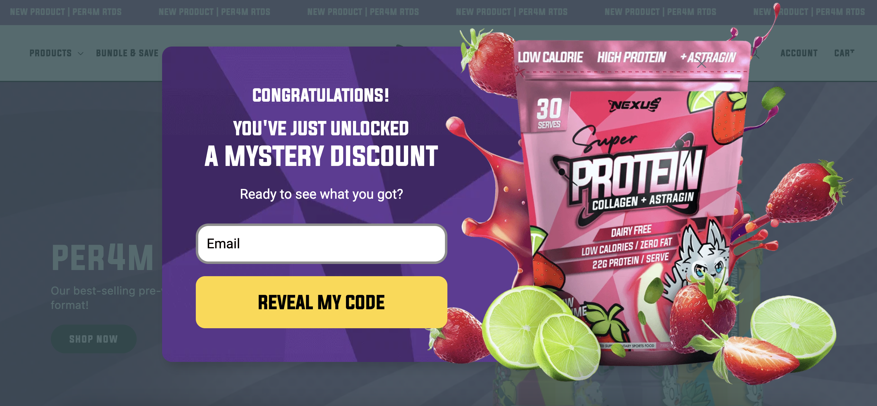
The result? A staggering 11.78% conversion rate. The element of surprise worked like magic, turning hesitant visitors into paying customers.
Exit-intent popups can be a real game-changer in conversion rate optimization, whether you’re looking to capture leads, reduce bounce rates, or prevent cart abandonment.
The key is to offer something compelling that grabs your visitor’s attention and makes them think twice about leaving—because once they’re gone, they might not come back.
Here are some exit-intent popup templates you can set up if you’d like to boost conversion rates:
3. Offer discounts or free shipping for first-time visitors
When it comes to encouraging new visitors to make their first purchase, a few conversion optimization tactics are as effective as a good deal.
Offering a first-time discount or free shipping can be the gentle nudge that turns a casual browser into a paying customer. It lowers the perceived risk and makes the decision to buy feel like a no-brainer.
Take Caraway, for example. They offer free shipping to first-time visitors.
Not only do they collect an email address, but they also ask for the visitor’s birthday—likely to send personalized offers or discounts on that special day. This adds a personal touch and builds anticipation for future interactions, increasing the likelihood of repeat purchases.
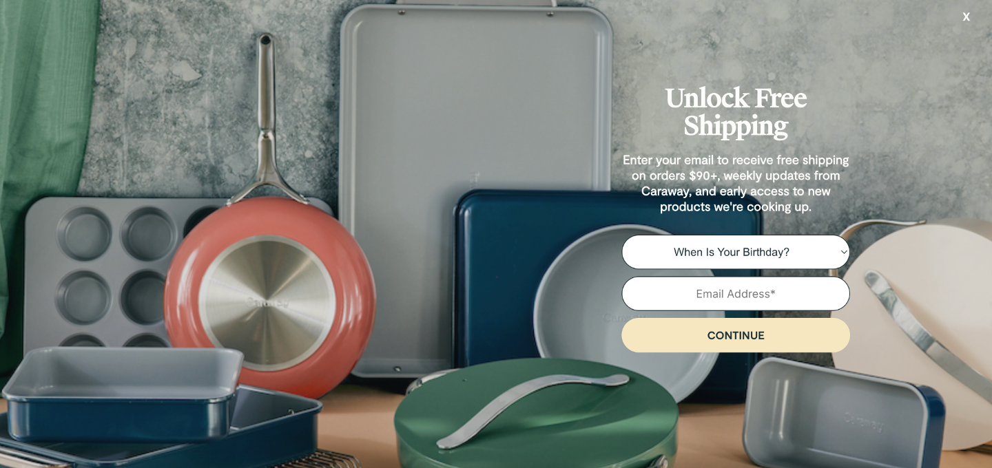
By providing a clear incentive for new customers, you’re reducing friction in the buying process and encouraging immediate action, all while building your email list for future marketing efforts.
It’s a win-win!
Ready to launch a popup that offers a discount for first-time visitors? Try these templates:
4. Simplify your checkout process
The checkout process is the last hurdle between you and a conversion—so you want to make it as smooth as possible. The more complicated your checkout form, the more likely a customer will abandon their cart.
To simplify the process, start by reducing the number of steps required to complete a purchase.
Ask only for essential information, and avoid asking customers to create an account upfront if they’re not ready. Offering a guest checkout option allows users to complete their purchase without the friction of setting up an account, which can speed things up significantly.
Another way to streamline the experience is to auto-fill forms with stored customer information or provide one-click payment options like Google Pay or PayPal.
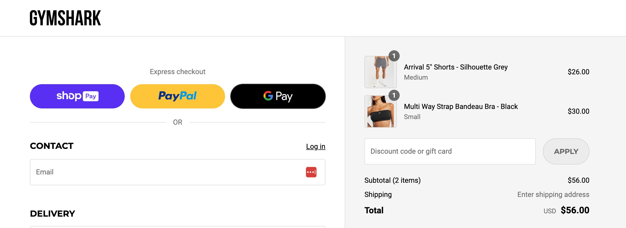
Remove any unnecessary distractions on your checkout pages, like additional offers, to keep the customer focused on completing their purchase.
Recommended reading: 16 Ecommerce Checkout Best Practices to Optimize Yours
5. Use trust badges and security features
People are increasingly cautious about sharing their payment information, especially with ecommerce sites they’re unfamiliar with. If your website doesn’t feel trustworthy, customers won’t hesitate to abandon their carts and take their business elsewhere.
This is where trust badges and security features come into play. Displaying well-known security badges like “Verified by Visa,” “McAfee Secure,” or “SSL Secured” can instantly reassure customers that their information is safe with you.
Make sure your site uses SSL encryption (you’ll know if your site URL starts with “https”) to protect sensitive customer data like credit card information.
Additionally, be transparent about your data privacy policies. Let customers know how their information is stored, protected, and used. Clear messaging around secure payments and data protection goes a long way in building trust, which can increase conversions.
6. Personalize the user experience
Consumers love personalization. In fact, 71% of consumers feel frustrated when a shopping experience is impersonal. To avoid this, you need to create an experience that feels tailored to each visitor.
Personalization starts with understanding your customers. Use data like browsing behavior, purchase history, and location to tailor product recommendations, content, and offers.
For example, if a customer is browsing a specific category, show them similar items they might like. Millie n Me does this effectively by displaying maxi dresses to users who have viewed similar styles and are about to leave the site without buying.
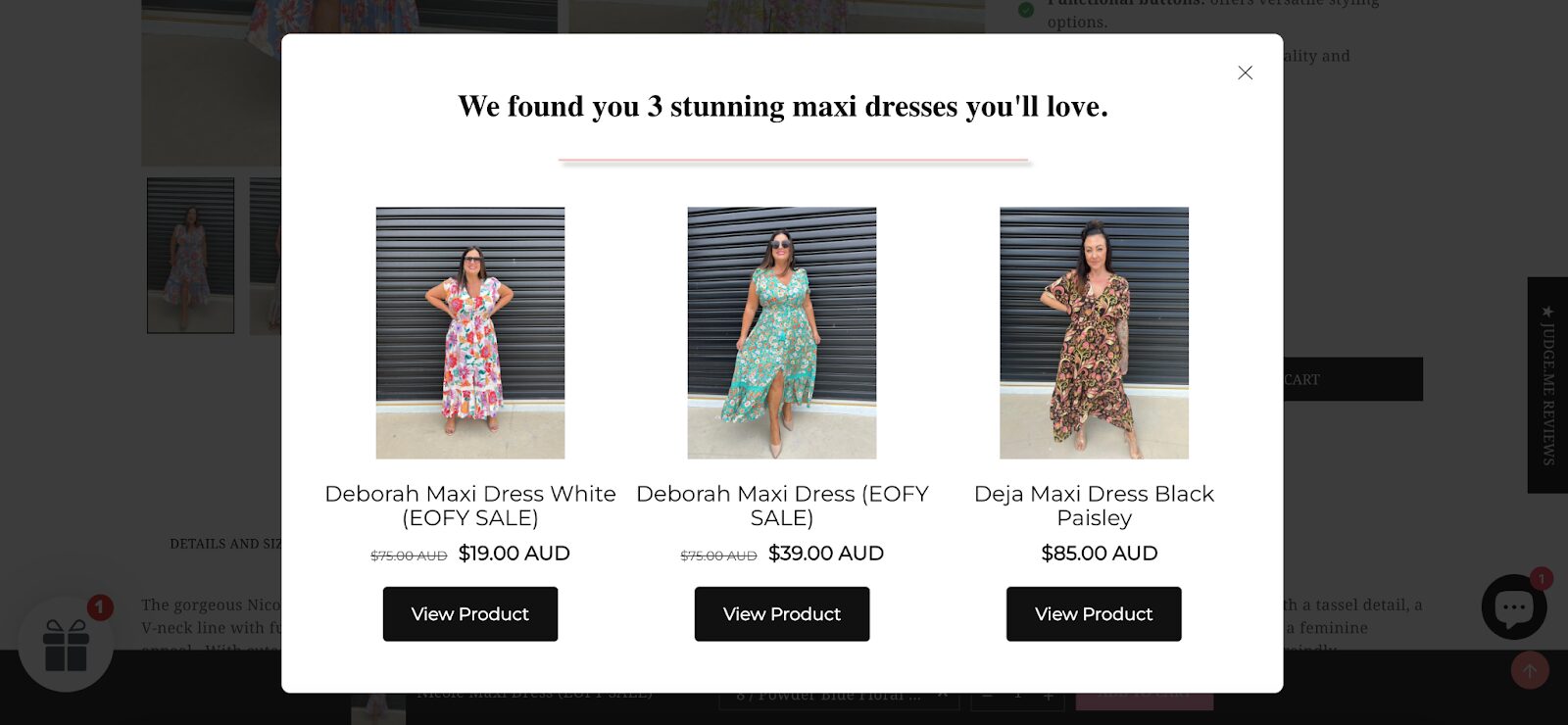
Here are some product recommendation popup templates you could use:
If a customer leaves without making a purchase and returns later, greet them with a personalized welcome back popup, just like ParfumeLab does. This makes the customer feel recognized and encourages them to pick up where they left off.
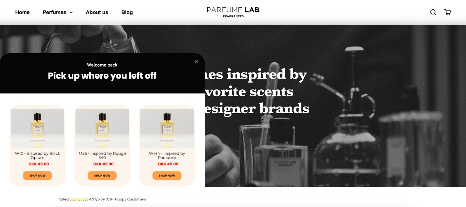
Try these templates if you want to improve conversions of returning visitors:
However, personalization extends beyond product recommendations. You can also use dynamic content on your site—tailored headlines, special offers, or even local currency displays based on the user’s region—to make the experience feel even more customized.
Check out this example with a personal greeting.
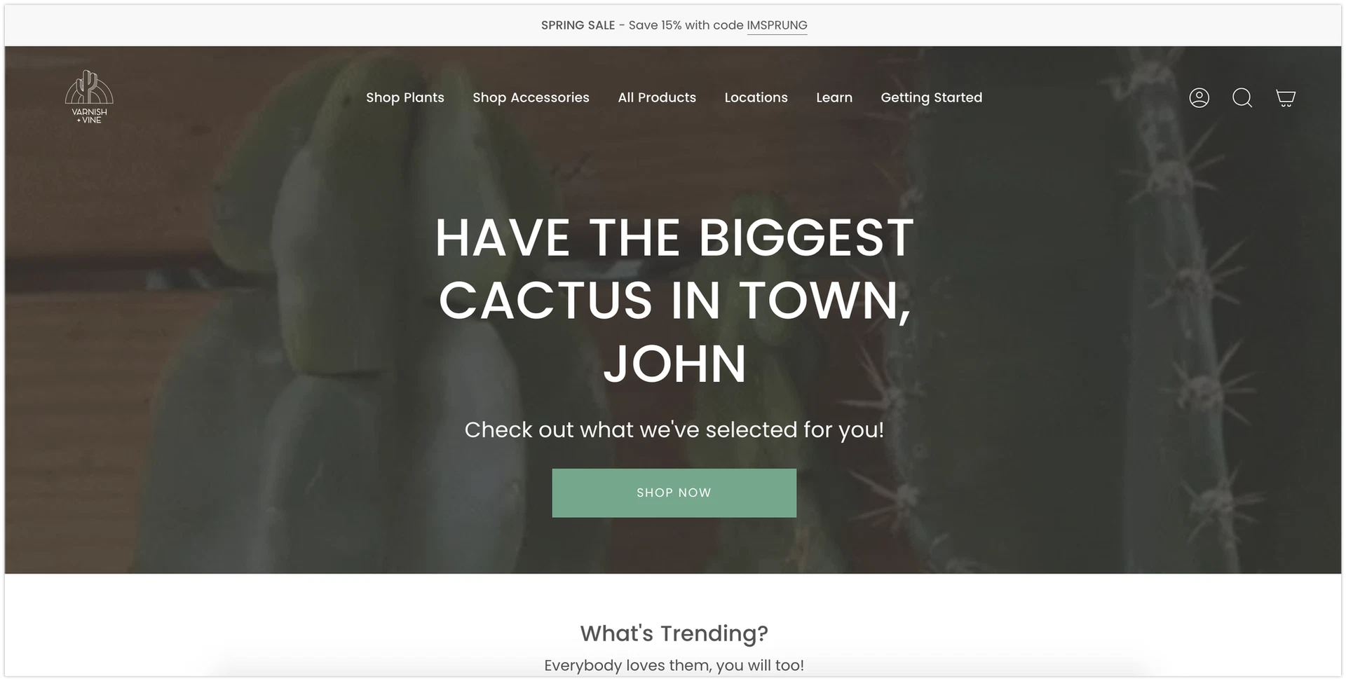
The more relevant the experience, the more engaged the user will be, which translates into higher conversions.
7. Create urgency with limited-time offers
When it comes to encouraging quick decision-making, nothing works quite like urgency. Humans have a natural fear of missing out (FOMO), and you can tap into that by creating a sense of urgency with limited-time offers.
Countdown timers are a great way to visually reinforce the limited-time nature of an offer. When users see the seconds ticking down, they’re more likely to make a quick decision rather than procrastinating.
How effective are countdown timers? Obvi ran a split test on two different variants of a discount popup: one with a countdown timer and one without, and they found that the version with the countdown timer increased conversion rates by 7.97%.
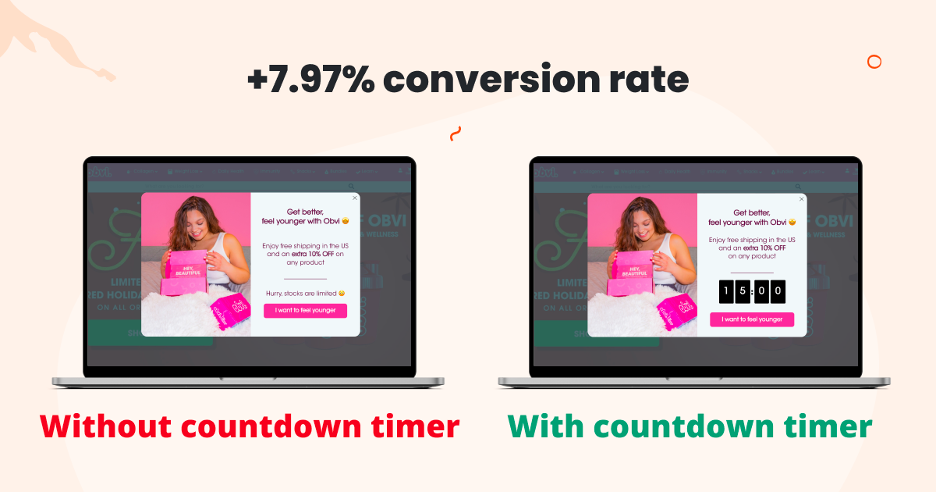
If you’d like to use this conversion rate optimization tactic masterfully, give these popup templates a try:
8. A/B test key elements of your website
When it comes to increasing conversions, sometimes small tweaks can lead to big results.
But how do you know what changes will work best? That’s where A/B testing comes in.
A/B testing allows you to compare two versions of a webpage—whether it’s the color of a CTA button, the wording of a headline, or the placement of a product image—and see which version performs better with real users.
For instance, if you’re not sure whether your “Buy Now” button should be red or green, A/B test it.
Want to see if adding a customer testimonial will increase sign-ups? Test it!
The key is to make data-driven decisions. Rather than guessing what will resonate with your target audience, A/B testing gives you concrete evidence based on real user interactions.
9. Optimize for mobile
More people are shopping on their phones than ever before. In fact, over half of all online traffic now comes from mobile devices.
To ensure a seamless mobile experience, your site should be fully responsive, meaning it adapts to any screen size. Make sure buttons and CTAs are easy to tap, forms are simple to fill out, and the checkout process is smooth.
Fast load times are also critical. Mobile users are more likely to abandon a site if it doesn’t load quickly.
A mobile site that’s optimized improves both user experience and conversion rates. With the rise of mobile commerce, this is one area you can’t afford to overlook.
10. Add social proof
When making purchasing decisions online, customers often look for reassurance that they’re making the right choice. Social proof—the concept that people are influenced by the actions and opinions of others—can be a powerful tool in building trust and driving more conversions.
There are several ways to incorporate social proof into your website:
- Customer reviews and ratings give visitors insight into the experiences of others who have purchased the product.
- Adding testimonials from satisfied customers can highlight the value of your product or service.
- Showcase user-generated content, like photos or videos from actual customers using your product, to build credibility.
Obvi’s product page is a great example of displaying customer reviews and user-generated content to create trust.
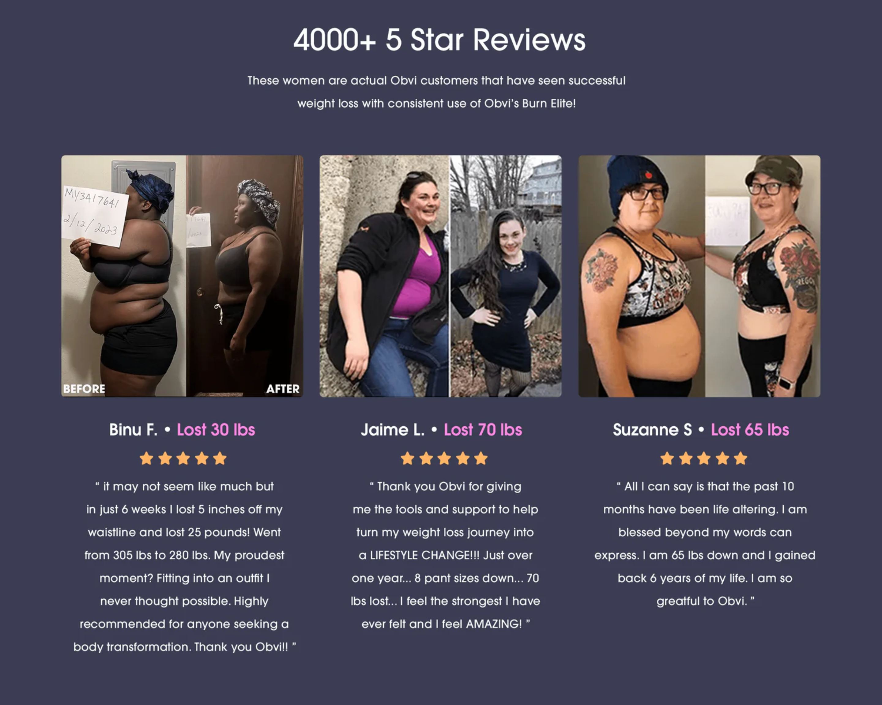
When new visitors see that others had a positive experience, they’re more likely to convert themselves.
11. Leverage cart abandonment emails
Did you know that over 70% of online shoppers abandon their carts before completing a purchase? It’s a massive lost opportunity—but one that can be easily salvaged with cart abandonment emails.
These follow-up emails are designed to remind customers of what they left behind and nudge them toward completing their purchase.
The key to an effective cart abandonment email is timing and value. Send the first email within a few hours after the cart is abandoned, and include a clear CTA to return and complete the purchase.
You can make the offer more compelling by adding incentives like a limited-time discount, free shipping, or even showcasing product reviews to build confidence.
12. Use FOMO techniques
Fear of missing out (FOMO) is a psychological trigger that can drive people to act quickly.
When potential buyers feel like they might miss out on a great deal, they’re more likely to complete their purchase on the spot. This can be particularly effective in ecommerce, where scarcity and urgency are powerful motivators.
You can easily create FOMO on your website by highlighting limited stock or showing how many people have recently purchased a product.
For example, Obvi’s Black Friday popup leveraged FOMO by emphasizing that their stock was running low, which helped them to increase conversions.
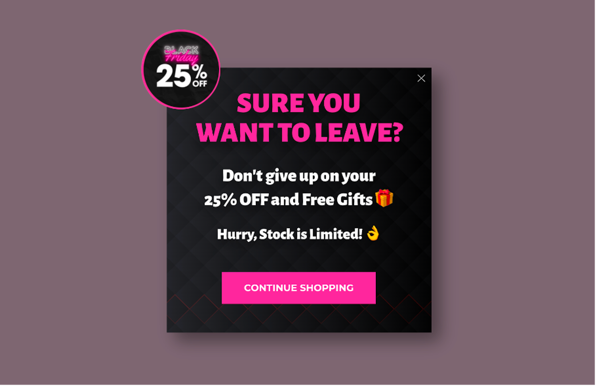
These real-time alerts trigger a sense of urgency and compel customers to act fast.
13. Offer multiple payment options
When it comes to finalizing a purchase, convenience is key. Offering multiple payment options gives your customers the flexibility to choose their preferred method, making the checkout process smoother and more accessible. Limiting payment options can cause frustration and result in abandoned carts.
Provide various popular options like credit cards, PayPal, Apple Pay, and Google Pay.
For customers who prefer traditional methods, consider including bank transfers or even cash-on-delivery (if applicable).
Some shoppers might also be more comfortable using buy now, pay later services like Klarna or Afterpay, especially for higher-priced items.
14. Use upselling and cross-selling techniques
Upselling and cross-selling are an easy way to boost your average order value (AOV) and maximize revenue from each customer. These strategies involve suggesting complementary products, upgrades, or add-ons when a customer is about to check out.
Think about it: if someone is buying a smartphone, they might also need a protective case or wireless headphones. Why not offer these related items right when they’re most likely to purchase?
The key to effective upselling is relevance. Suggest items that genuinely complement what the customer has already added to their cart, rather than bombarding them with unrelated offers.
Another smart approach is to offer premium versions of the products they’re considering. For example, if they’re looking at a basic model, present a slightly upgraded version for just a little more. Customers are often willing to spend more when they see the added value.
Retail giants like Amazon use upselling to perfection with their “Frequently Bought Together” and “Customers Who Bought This Also Bought” suggestions.
By incorporating upsell techniques, you can increase sales and improve customer satisfaction by providing them with a more complete shopping experience.
15. Speed up your website
No one likes waiting for a slow website to load. Studies show that 53% of users will abandon a website that takes more than three seconds to load, and every second of delay can lead to a significant drop in conversion rates.
To optimize your website’s speed, start by compressing images and reducing file sizes without compromising quality.
Use a content delivery network (CDN) to distribute your site’s content across multiple servers, which speeds up load times for users around the world.
Additionally, reduce server response times by optimizing your backend processes, and consider enabling browser caching so returning visitors don’t have to wait for your site to load again.
16. Use clear and compelling call-to-actions
Your call-to-action (CTA) is one of the most critical elements of your website. It’s the gateway to conversions, guiding visitors toward the action you want them to take—whether that’s making a purchase, signing up for a newsletter, or downloading a resource.
A well-designed CTA should be bold, actionable, and impossible to miss.
To make your CTA effective, use clear and concise language that tells users exactly what they’ll get by clicking. Phrases like “Buy Now,” “Get Started,” or “Claim Your Discount” are direct and motivate action.
The design also matters—ensure that your CTA buttons stand out from the rest of the page, using contrasting colors to grab attention.
Placement is equally important. Your CTAs should be positioned in highly visible areas, like above the fold or next to product images, to maximize clicks.
Recommended reading: 10 Best Practices for Optimizing Your Call-to-Action Buttons
17. Implement a money-back guarantee
For customers who are on the fence about making a purchase, a money-back guarantee can be the ultimate trust-builder.
When you offer a no-risk option, you remove a significant barrier to conversion—the fear of wasting money. Customers are more likely to go through with their purchase if they know they can get a full refund if they’re not satisfied.
This approach lowers the perceived risk, making the buying decision safer and easier.
The Oodie uses generous return policies and money-back guarantees to build strong customer trust and loyalty. The key is to make your return policy clear and easy to find, with no hidden terms or overly complicated processes.
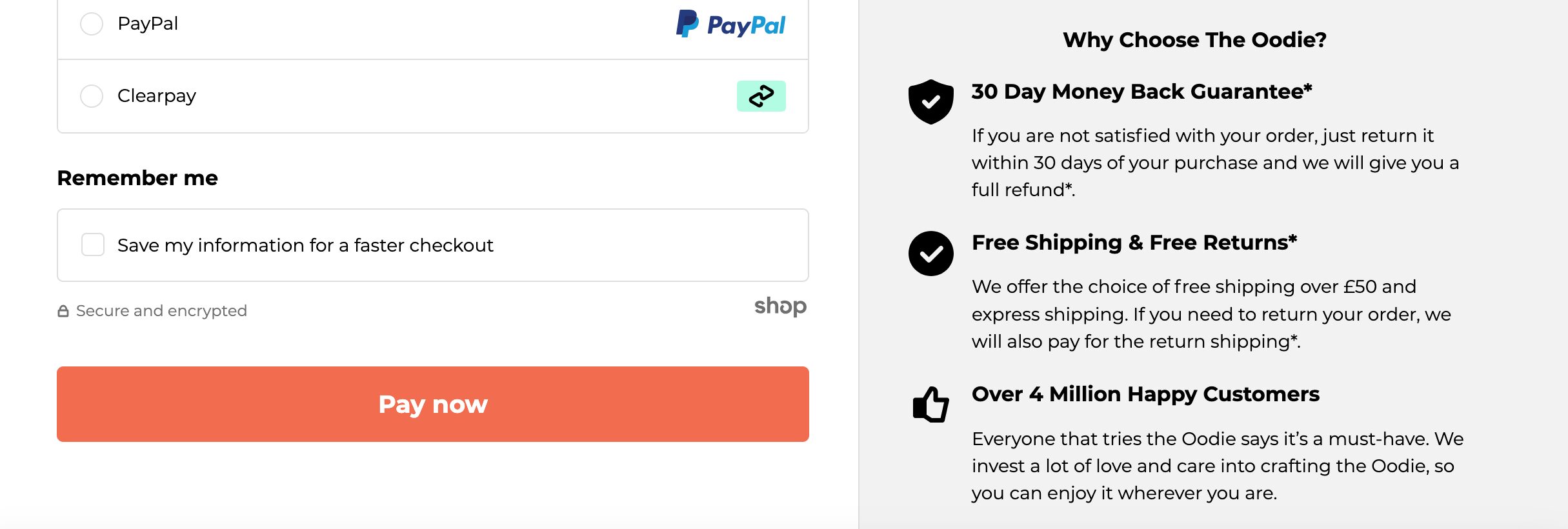
The simpler and more transparent the guarantee, the more effective it will be in converting hesitant buyers.
18. Use retargeting ads to bring back visitors
Not every customer converts on their first visit. In fact, many visitors need to be reminded of the products they were interested in before making a final decision. This is where retargeting ads come into play.
Retargeting allows you to show personalized ads to users who have previously visited your site but didn’t convert. These ads can feature the specific products they viewed, a reminder of their abandoned cart, or even a special discount to entice them back.
Platforms like Facebook and Google make it easy to set up retargeting campaigns that display ads across websites and social media.
The key to successful retargeting is personalization. Instead of showing a generic ad, remind the user of the exact products they were considering or offer an exclusive incentive to return.
19. Segment your email campaigns
Email marketing remains one of the most effective ways to engage customers and drive conversions, but generic, one-size-fits-all campaigns can easily get lost in the noise.
The solution? Segmentation.
By segmenting your email list based on user behavior, demographics, or purchase history, you can tailor your messages to resonate with each group more effectively.
For example, you could send different offers to first-time customers versus returning customers or create campaigns specifically for users who have abandoned their carts.
You might also target customers based on their browsing behavior, sending personalized recommendations for products they’ve shown interest in.
Segmented email campaigns typically see higher open rates, click-through rates, and conversions because the content feels more relevant to the recipient.
20. Use popup surveys for customer feedback
Ever wondered why visitors leave your site without buying? One of the easiest ways to find out is simply to ask them.
By using on-site popup surveys, you can gather real-time feedback directly from users before they bounce. These surveys are quick, non-intrusive, and give you valuable insights into potential pain points or roadblocks that might be preventing conversions.
For example, you can ask visitors why they didn’t complete their purchase…
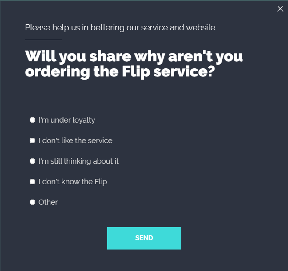
…or simply ask what they thought of your website.
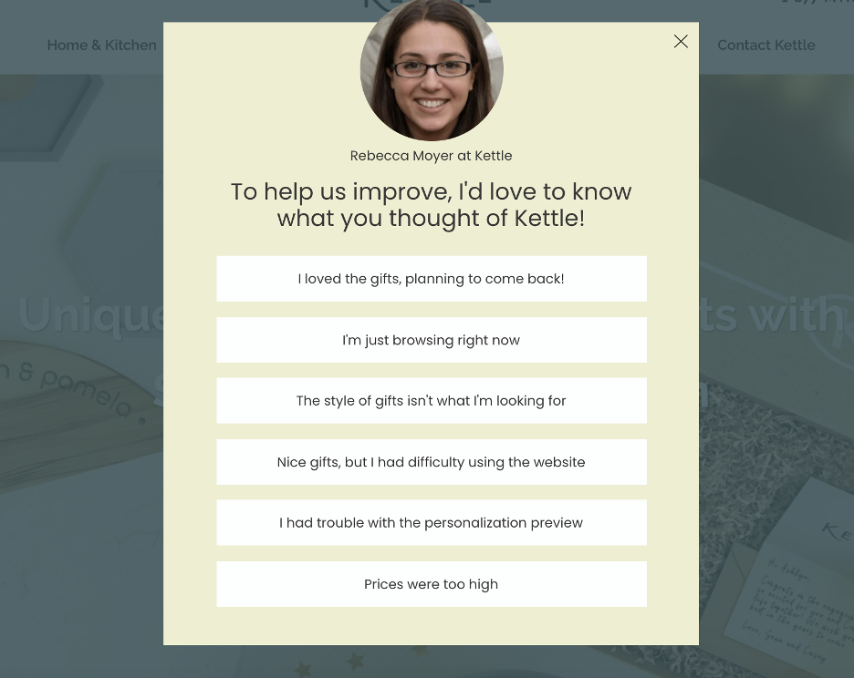
The feedback you gather will help you fine-tune your website to better meet user needs, whether it’s fixing navigation issues, addressing pricing concerns, or improving product descriptions. In the long run, these insights can significantly boost your conversion rates.
Would you like to collect feedback? Try these popup templates:
21. Optimize your product descriptions
Your product descriptions aren’t just there to explain what your product is—they need to sell the benefits and solve problems for your customers.
People don’t buy features, they buy solutions that improve their lives in some way. A great product description doesn’t just list specs—it paints a picture of how the product can make things better.
To craft compelling descriptions, focus on how your product will meet the customer’s needs or address their pain points.
For example, instead of saying a vacuum cleaner has “high suction power,” explain that it “makes cleaning easier by picking up more dirt in less time.” Use clear, engaging language, and avoid jargon that might confuse or overwhelm potential buyers.
Additionally, make sure your descriptions are scannable—break them up with bullet points, headers, and short paragraphs so users can quickly find the information they need.
FAQ
Why is my website conversion rate so low?
There could be several reasons, from slow page load times to a complicated checkout process. Start by analyzing your user behavior and A/B testing different elements of your site to find the roadblocks.
What is a good conversion rate for a website?
While it varies by industry, the average conversion rate is 1.81%. Anything above 3% can be considered good. However, with the right conversion rate optimization strategies in place, you can aim for even higher.
What is a conversion funnel?
A conversion funnel refers to the path visitors take from entering your site to completing a desired action (like making a purchase). Optimizing every step of this journey is key to increasing your conversion rate.
Wrapping up
Improving your website’s conversion rate doesn’t have to be a mystery.
By implementing these 21 conversion rate optimization tips, you can fine-tune your site to engage visitors, build trust, and drive more conversions—without spending more on traffic.
So, why wait? Start optimizing today!
Migration has never been easier
We made switching a no-brainer with our free, white-glove onboarding service so you can get started in the blink of an eye.
What should you do next?
Thanks for reading till the end. Here are 4 ways we can help you grow your business:
Boost conversions with proven use cases
Explore our Use Case Library, filled with actionable personalization examples and step-by-step guides to unlock your website's full potential. Check out Use Case Library
Create a free OptiMonk account
Create a free OptiMonk account and easily get started with popups and conversion rate optimization. Get OptiMonk free
Get advice from a CRO expert
Schedule a personalized discovery call with one of our experts to explore how OptiMonk can help you grow your business. Book a demo
Join our weekly newsletter
Real CRO insights & marketing tips. No fluff. Straight to your inbox. Subscribe now
Nikolett Lorincz
- Posted in
- Ecommerce
Partner with us
- © OptiMonk. All rights reserved!
- Terms of Use
- Privacy Policy
- Cookie Policy
Product updates: January Release 2025

