- Blog
- What is a Landing Page Popup & How to Use It Effectively
What is a Landing Page Popup & How to Use It Effectively
-
Barbara Bartucz
- Conversion
- 6 min read
Table of Contents
Picture this: You’re navigating through a website, intrigued by the content, when suddenly, a small window pops up on your screen.
Annoying? Not if it’s used correctly. Effective? Absolutely. These little windows, known as landing page pop-ups, can significantly impact your website’s performance.
In this article, we’ll explore the benefits of these landing page popups, explore best practices, and show you ten inspiring popup examples.
Let’s dive right in!
What is a landing page pop-up?
A landing page pop-up is a window that appears on a visitor’s screen, triggered by specific actions like scrolling, spending a certain amount of time on the page, or even attempting to close the browser.
These pop-ups can serve various purposes, from collecting email addresses to promoting special offers.
There are different types of pop-ups including:
- Exit intent pop-ups: Exit intent pop-ups appear when a visitor is about to leave your site. They aim to capture attention one last time, often offering a special deal or asking for feedback.
- Timed pop-ups: These are triggered after a visitor has spent a predetermined amount of time on the page, which indicates a certain level of interest.
- Scroll-based pop-ups: These pop-ups appear when a visitor scrolls to a specific point on the page, ensuring they see the pop-up only after engaging with your valuable content.
Pop-ups can serve various purposes, such as:
- Collecting emails: One of the most popular ways to use pop-ups is for expanding an email list.
- Promoting offers: They can spotlight special deals or discounts.
- Providing information: Pop-ups can convey important updates or news.
What are the benefits of using landing page pop-ups?
Using landing page pop-ups can lead to numerous benefits:
- Increased conversion rates: By capturing visitor information or promoting offers on your landing pages, pop-ups can boost your conversion rates.
- Improved user engagement: Well-timed pop-ups can keep visitors on your site longer and encourage interaction.
- Enhanced lead generation: Collecting email addresses through pop-ups can grow your email list significantly.
- Driving specific actions: Whether it’s downloading a resource, signing up for a newsletter, or making a purchase, pop-ups can guide visitors towards specific actions.
Best practices for using landing page popups effectively
To ensure your landing page pop-ups are a help rather than an interference, here are some best practices to follow.
1. Find the right timing
Timing is crucial for pop-up success. Displaying a pop-up at the right moment can significantly increase its effectiveness and reduce annoyance.
An exit-intent pop-up, which appears when a visitor is about to leave your site, can capture the visitor’s attention with a last-chance offer or a brief survey.
Timed pop-ups engage visitors who have spent a fixed amount of time on your page.
For example, a landing page pop-up could appear 30 seconds into a visit, offering a discount or a free resource once the visitor has had a chance to get their bearings and explore a bit.
2. Use a clear and compelling design
Your pop-up should be visually appealing and easy to understand at a glance. A cluttered or confusing design can drive website visitors away, so simplicity and clarity are key.
Use attractive colors, images, and fonts that align with your brand’s aesthetics to grab attention without overwhelming the potential customer.
Ensure your pop-up looks great and functions well on mobile devices, as a significant portion of web traffic comes from mobile.
Additionally, make it easy for users to close the pop-up if they’re not interested by providing a small, clearly visible close button.
This helps maintain a positive user experience and prevents frustration.
3. Craft a compelling messaging
Nailing the messaging of your pop-up is crucial for capturing attention and driving action.
Your headline should be concise and compelling, immediately conveying the value or benefit of engaging with the pop-up.
The call-to-action (CTA) should be straightforward and enticing, guiding visitors towards the desired action with phrases like “Get Your Discount Now” or “Download Your Free Guide.”
Provide a strong incentive for the visitor to click, such as a discount, a free resource, or exclusive content. Ensure the offer is relevant and valuable to your audience.
4. Personalize your popup
Personalization can significantly boost the effectiveness of your landing page pop-ups by making them more relevant to individual visitors.
Segment your audience based on behavior, preferences, or demographics, and tailor your pop-ups to these segments for a more personalized experience.
Use visitor behavior to trigger specific pop-ups, such as showing a “welcome back” pop-up to returning visitors or offering a special discount to someone who has viewed multiple products.
Address visitors by name if possible, and tailor the content to their interests, as personalized messages are more likely to resonate and drive engagement.
5. Test and optimize
Continuous testing and optimization are essential for maximizing the performance of your pop-ups. Regularly test different versions of your pop-ups to determine which elements perform best, experimenting with various headlines, CTAs, design choices, and triggers.
Monitor key metrics such as conversion rate, bounce rate, and user engagement to assess the effectiveness of your pop-ups and use this data to make improvements.
Remember to continuously refine your website pop ups, as small tweaks can lead to significant improvements in performance over time.
+1. Bonus tip
Using pop-ups with fewer form fields can reduce friction and lead to a higher number of conversions.
When visitors encounter a lengthy form, they may feel overwhelmed or discouraged, leading them to abandon the form altogether.
By minimizing the amount of information you request, you make it easier for users to complete the form, resulting in more conversions.
10 popup examples to inspire you
Now that we’ve got the basics down, let’s check out some inspiration with 10 fantastic landing page pop-up examples to fuel your creativity!
1. Furbo
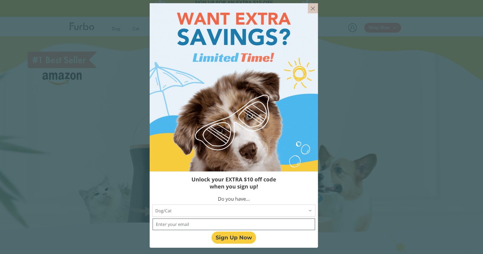
Furbo’s limited-time offer creates a sense of urgency and FOMO (fear of missing out) in website visitors.
Who doesn’t want savings, right? They entice visitors with an extra $10 off if they sign up.
Plus, they ask whether the visitor has a dog or a cat, allowing them to provide personalized offers later on.
2. William Painter
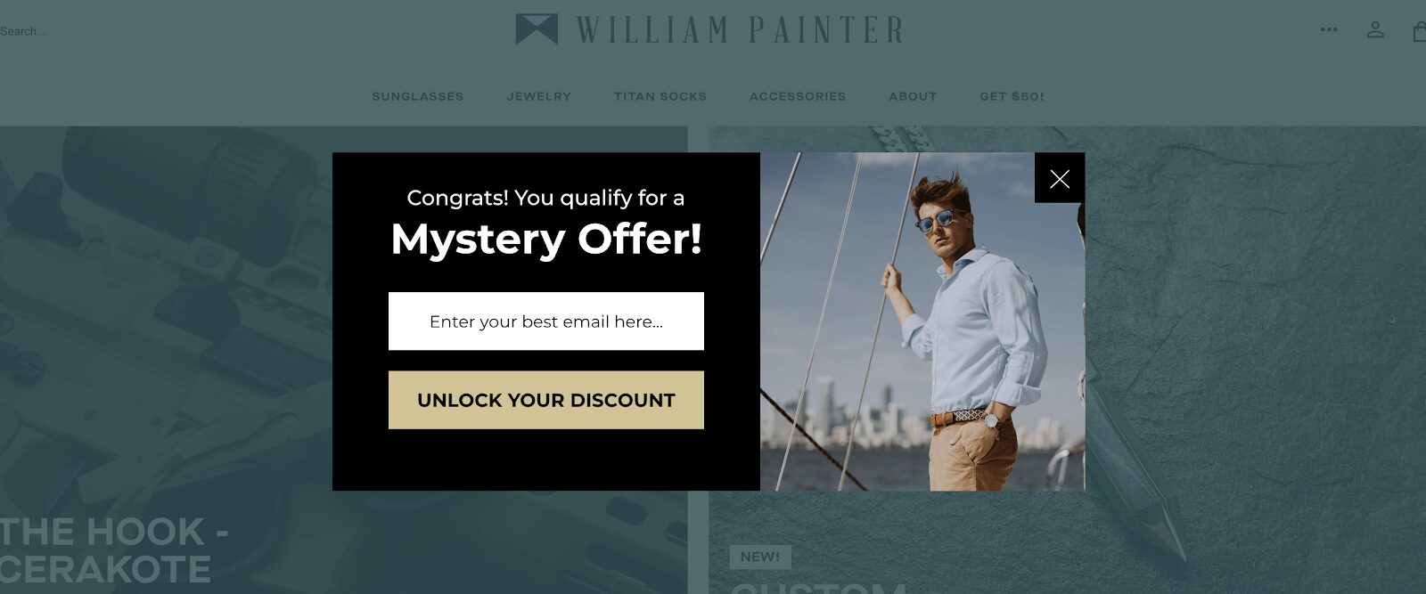
William Painter’s pop-up adds a bit of mystery and excitement.
Instead of the typical 10% off, they offer a mystery discount, which piques curiosity and encourages visitors to take action to find out what the discount is.
This approach not only captures interest but also creates a memorable interaction, increasing the likelihood of conversion.
3. RYZE Mushroom Coffee
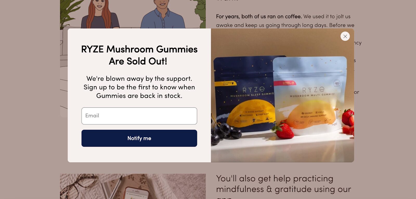
Discount codes aren’t the only way to delight customers. RYZE Mushroom Coffee builds trust and fosters a positive brand image by keeping customers informed about stock levels.
If an item is out of stock, they display a pop-up form allowing visitors to leave their contact details so they can be notified when the item becomes available again.
4. Perifit
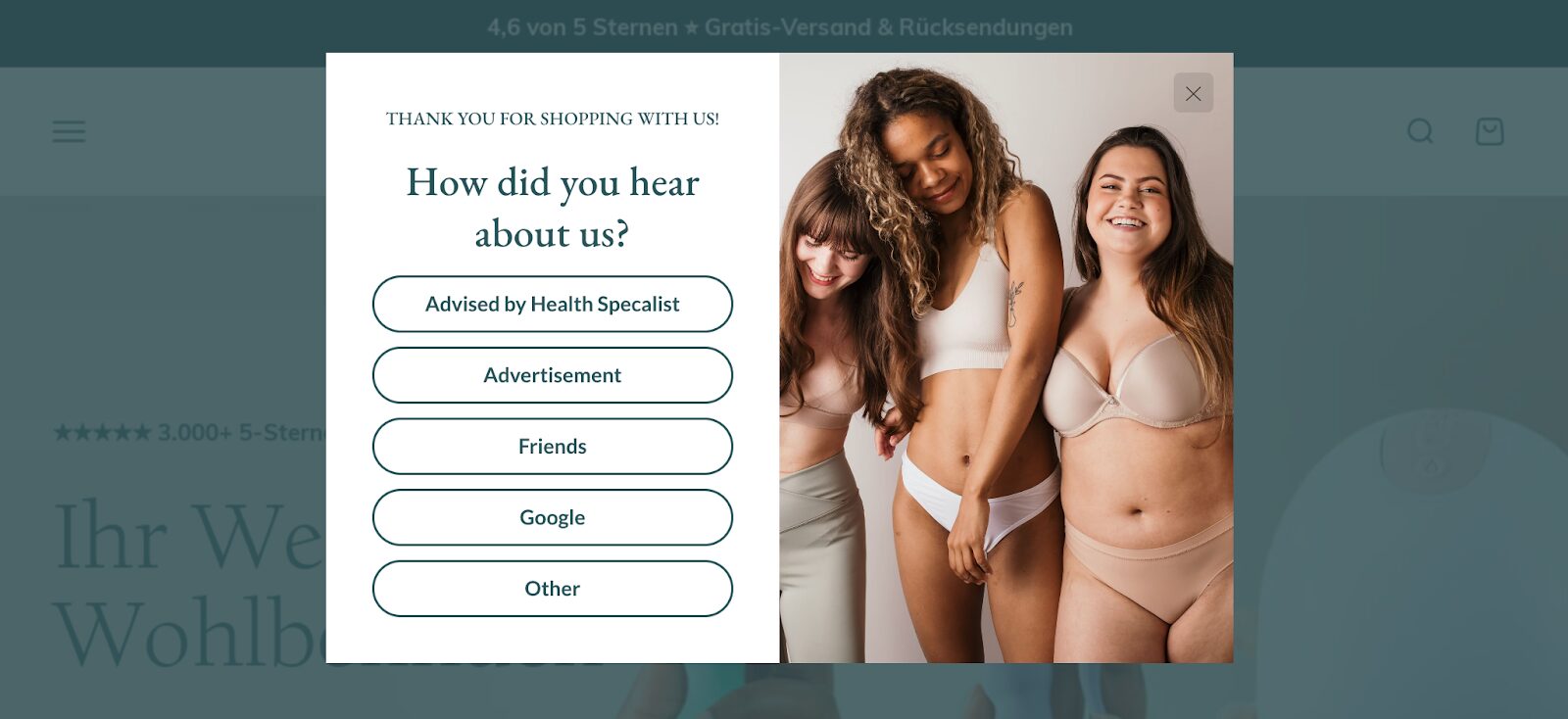
Perifit’s pop-up asks visitors how they heard about the site, which helps gather valuable information about their sources.
By knowing their audience’s origin, Perifit can tailor their marketing strategies more effectively, reaching out to potential customers with personalized and relevant messages.
5. Goldelucks
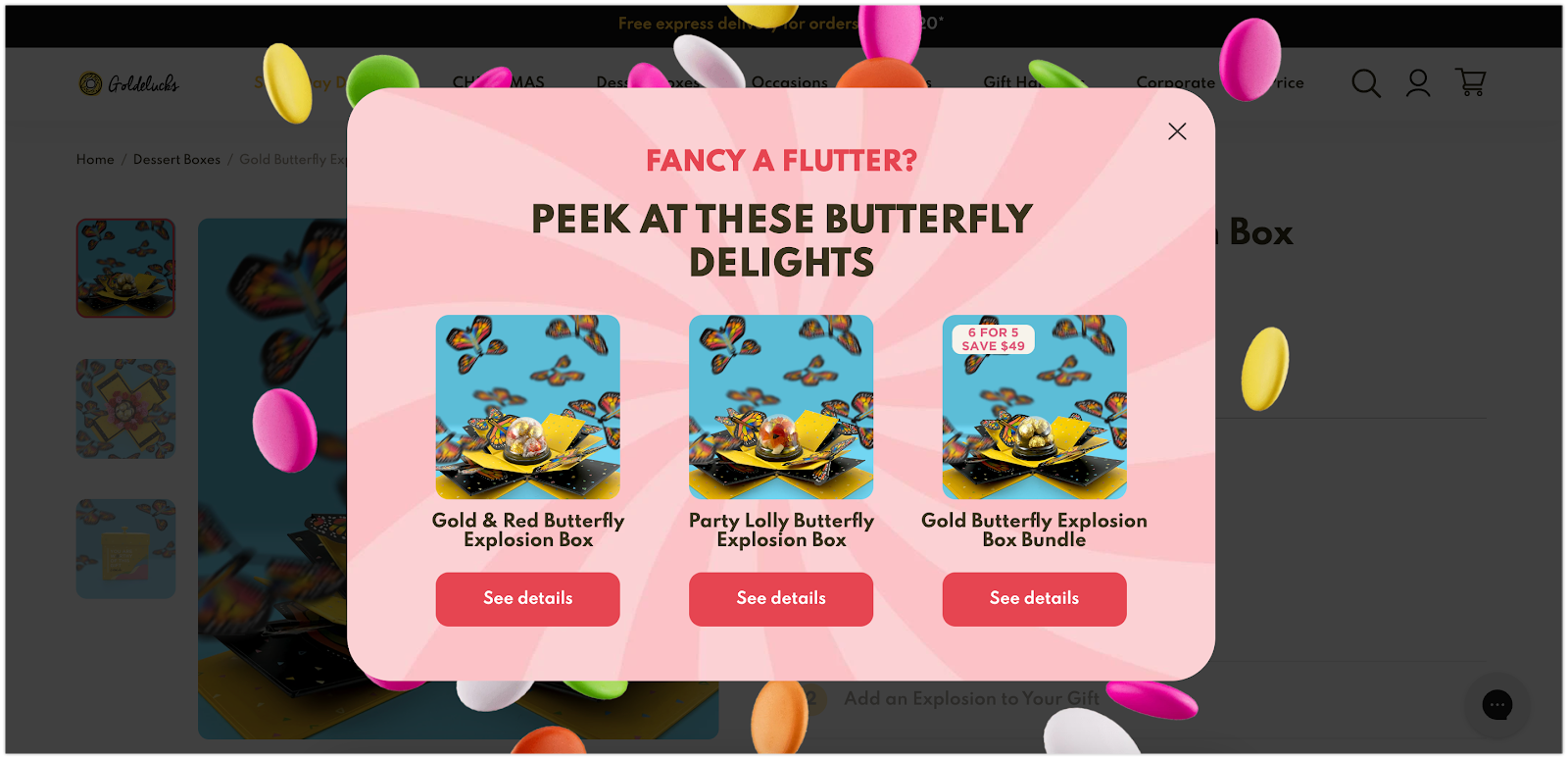
Product recommendations can significantly boost conversions. Goldelucks uses Smart Popups to show visitors similar items based on their browsing history and preferences.
This targeted approach makes visitors feel understood and valued, increasing the likelihood that they’ll make a purchase.
By using Smart Popups, Goldelucks boosted their conversion rates by 12%, demonstrating the power of personalization in pop-ups.
6. Bukvybag
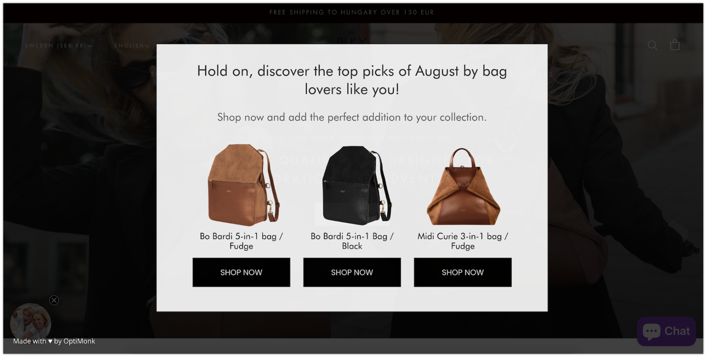
Bukvybag effectively uses exit-intent pop-ups to offer seasonal favorites, generating leads and educating customers about their products.
By showcasing their August favorites, they keep visitors engaged and informed about their latest offerings, even as they attempt to leave the site.
This strategy not only captures potential leads but also encourages visitors to explore more of their product range.
7. Lammle’s
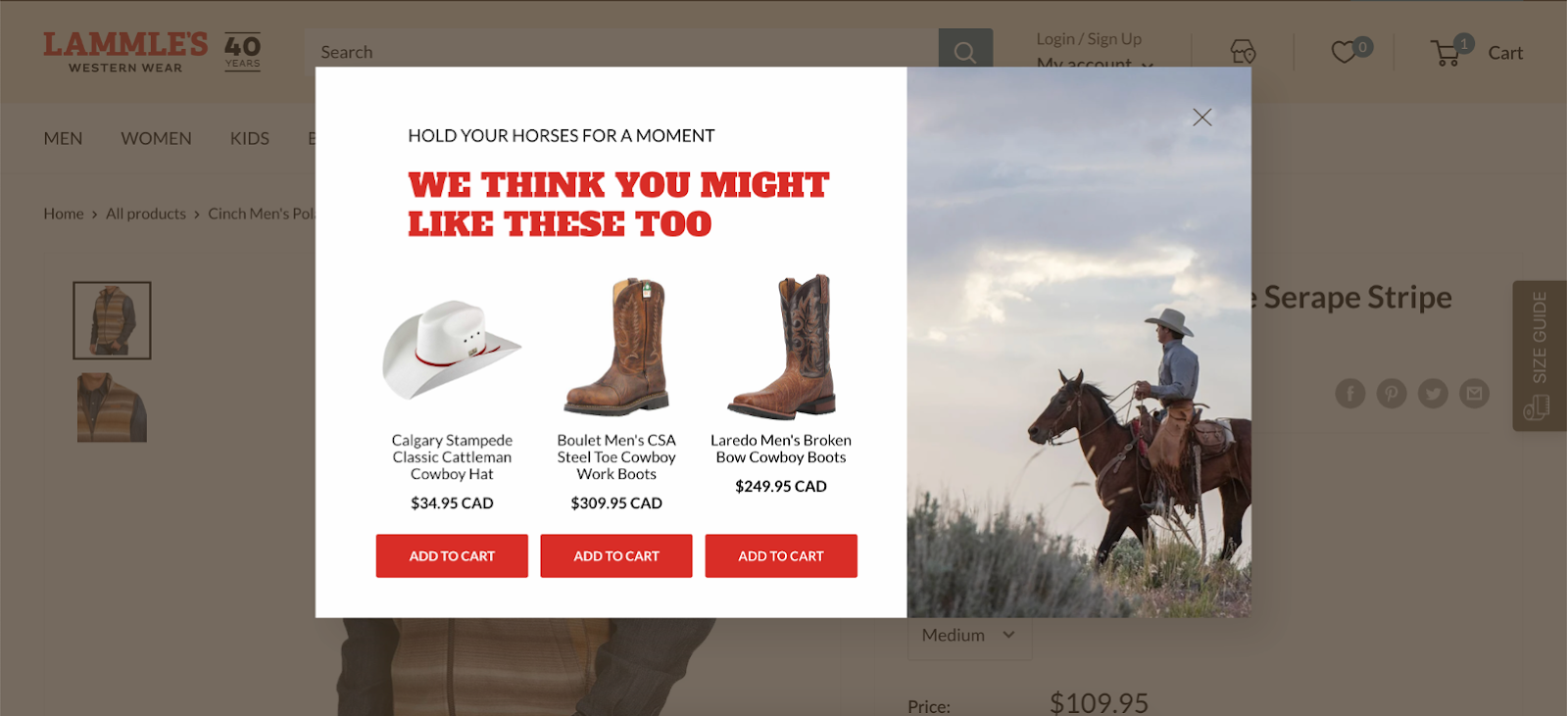
Lammle’s pop-ups strategically highlight their bestsellers, increasing revenue from product page visitors by 23.5%.
By prominently displaying their top-selling products, they attract more interest and drive sales. This approach leverages the popularity of certain items to entice visitors, turning casual browsers into buyers.
8. Crown & Paw
Crown & Paw’s pop-up strategy is a masterclass in boosting conversions.
They start with a tempting discount and the promise of personalized product recommendations to ensure visitors click.
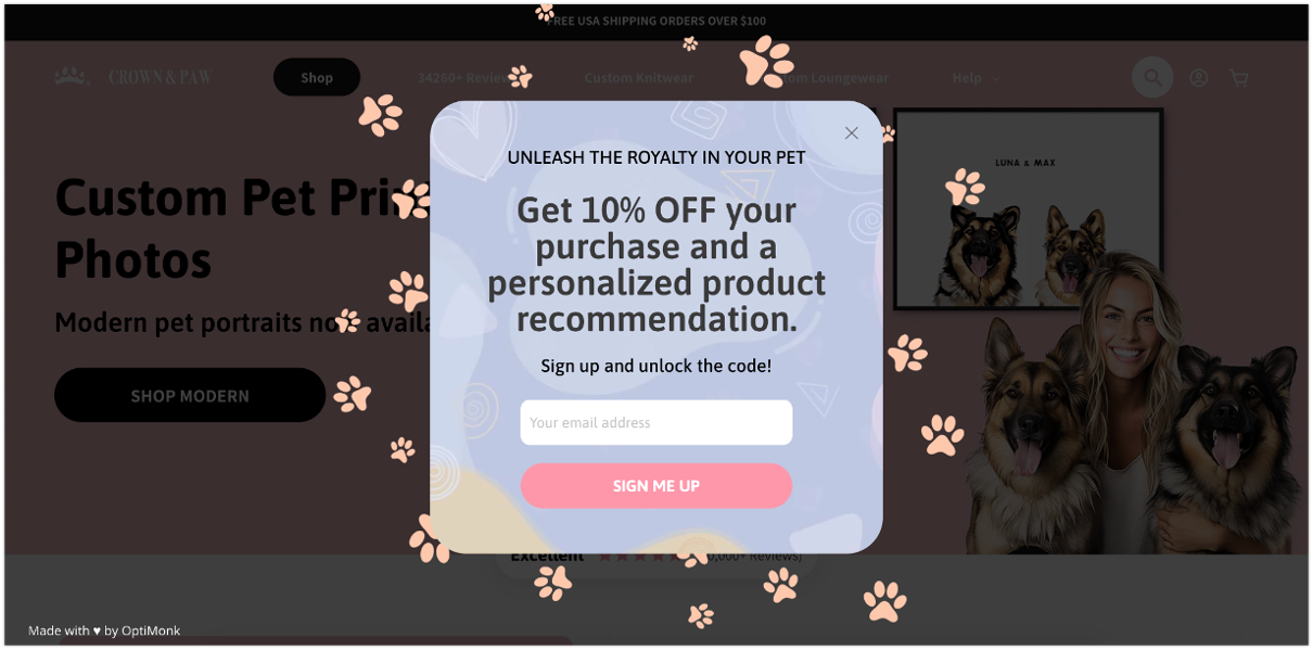
After grabbing their attention, they ask a few questions about their visitors’ pets.
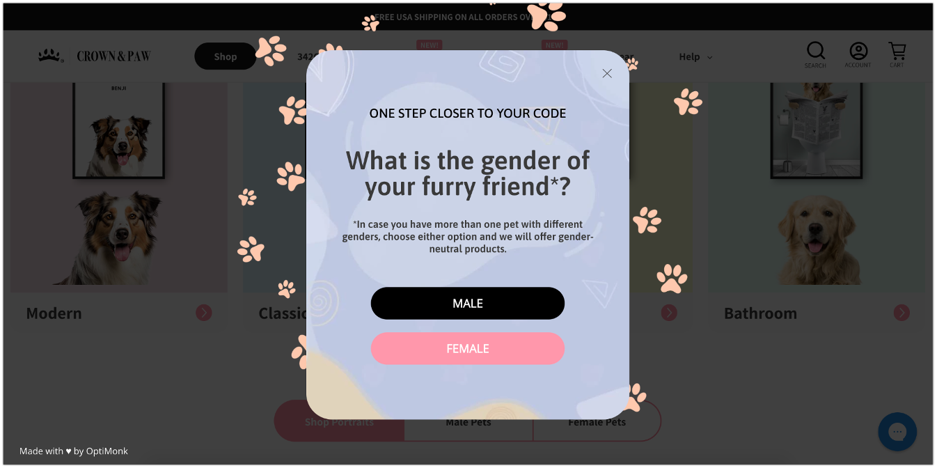
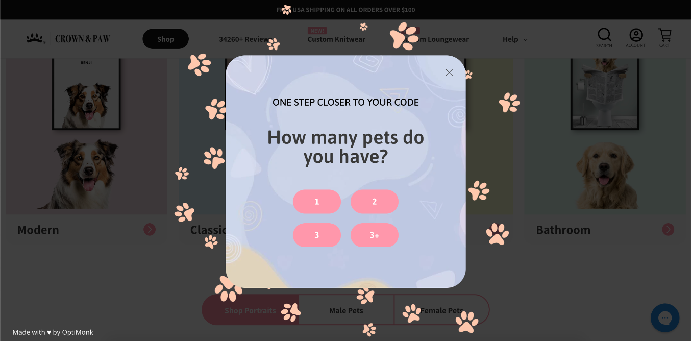
Finally, they deliver the discount code along with tailored product suggestions.
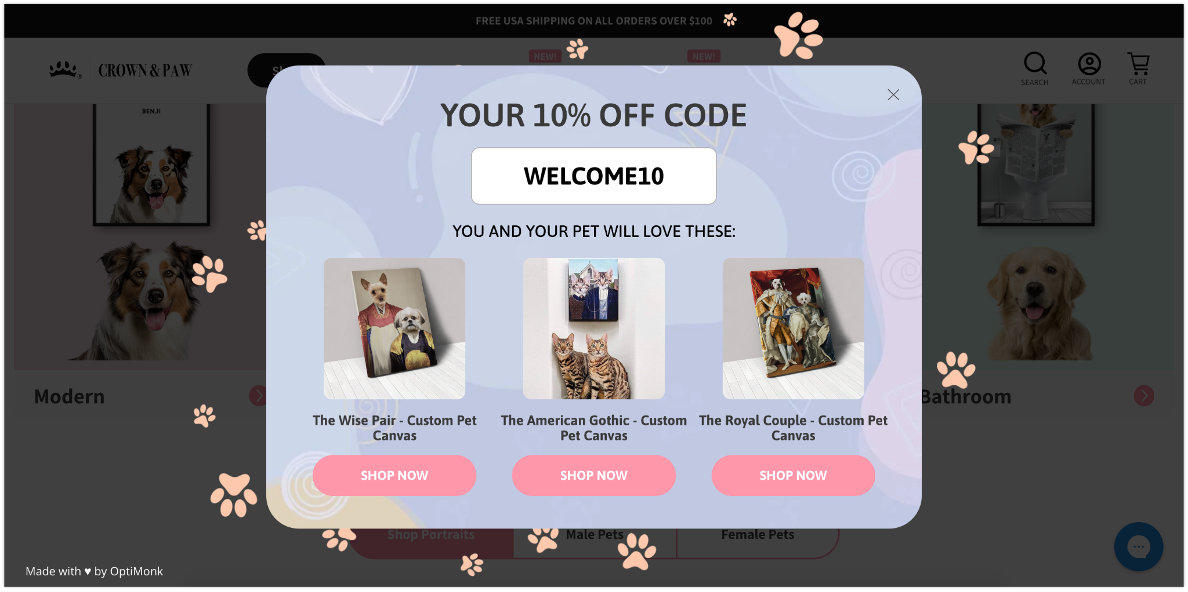
This multi-step process resulted in a 4.03% conversion rate, which is a 2.5X increase compared to the simple email pop-up they had been using before.
9. Craft Sportswear NA
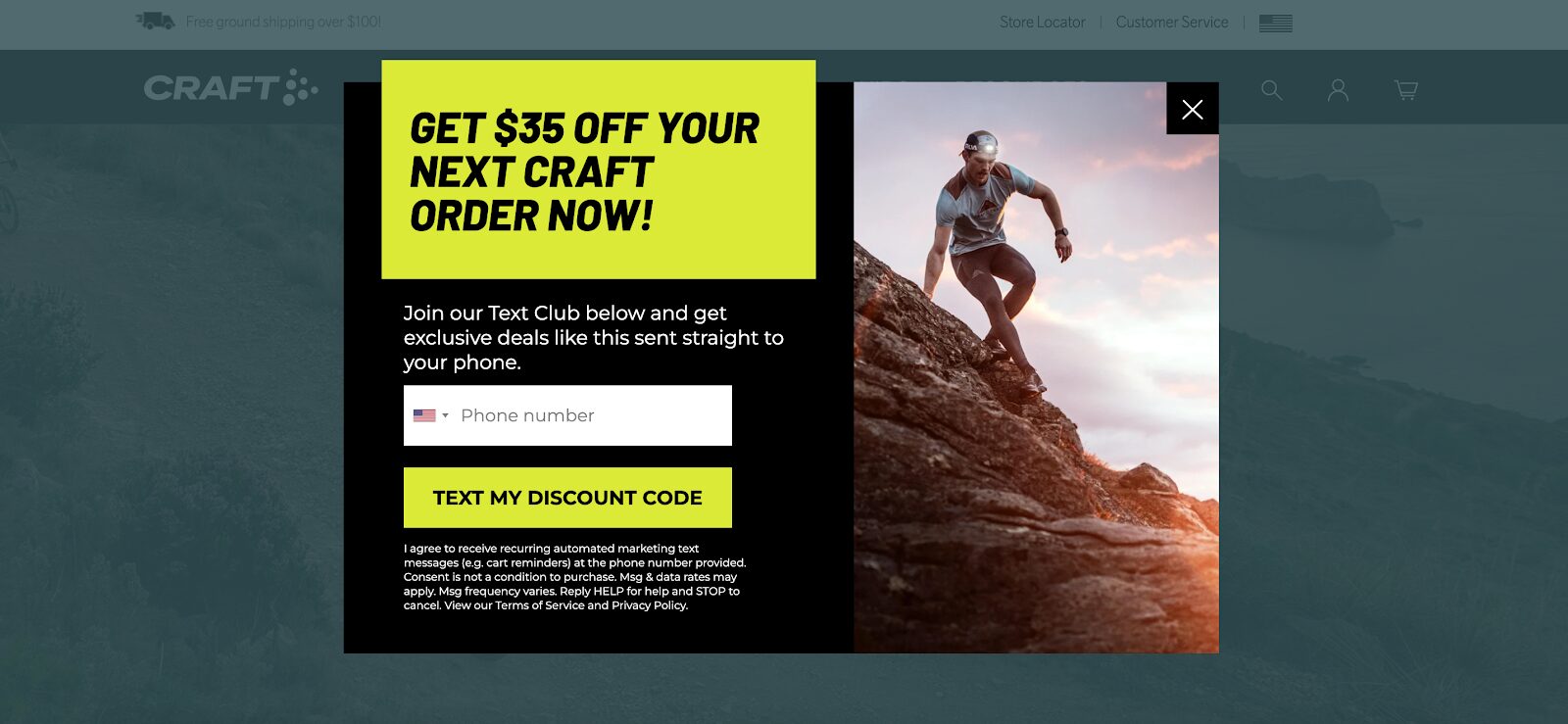
Craft Sportswear treats their loyal customers like VIPs by encouraging current email subscribers to join their Text Club.
They offer a generous $35 off the next order in exchange for phone numbers, and then seal the deal with a clear call-to-action.
This strategy not only expands their SMS marketing list but also makes visitors feel valued and appreciated, fostering deeper loyalty.
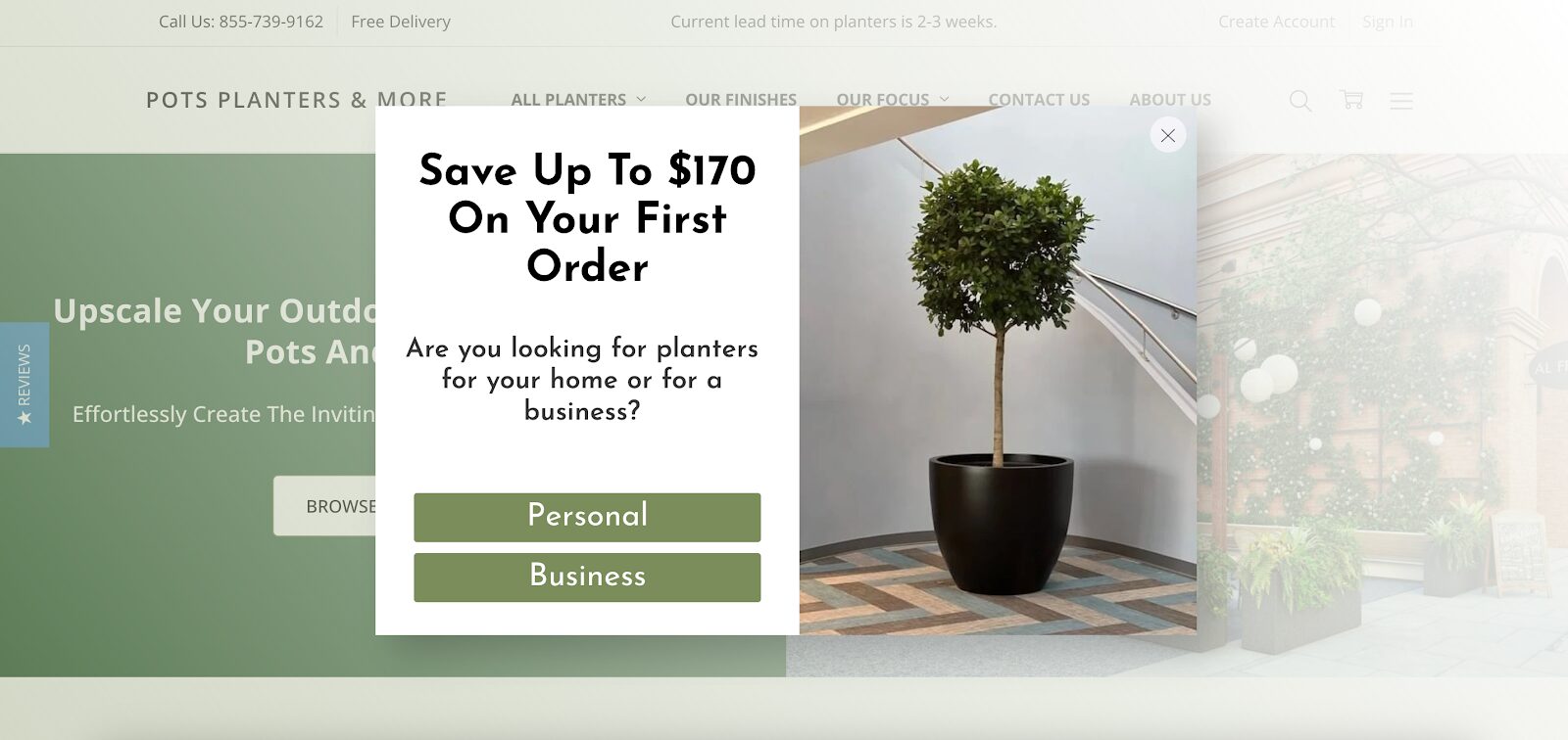
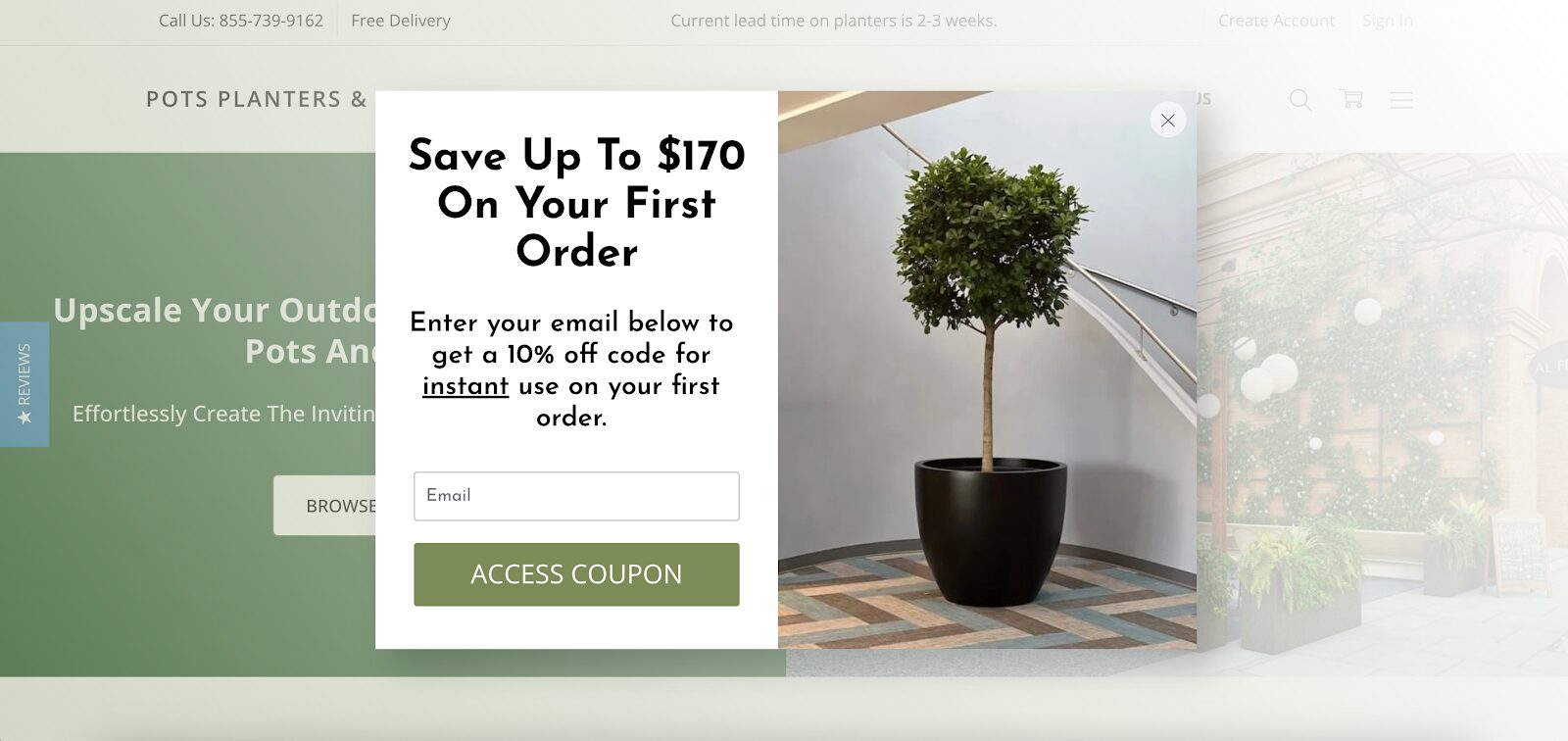
10. Pots, Planters & More
Pots, Planters & More uses a segmentation pop-up to gather qualified leads and offer personalized discounts.
Initially, they allow visitors to self-segment by choosing their reason for shopping.
Next, they use the pop-up form to capture email addresses, gathering qualified leads.
Finally, they provide coupon codes based on the visitor’s segment. Pretty cool, right?
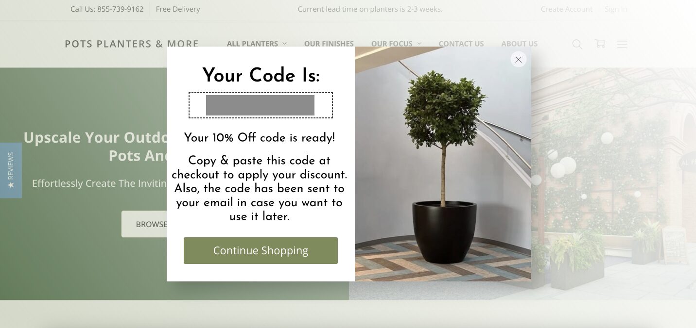
This multi-layered approach ensures that visitors receive relevant offers in the future, increasing the chances of conversion and boosting customer satisfaction.
How to create a popup in just a few minutes?
Ready to create your own pop-up? Here’s a quick guide using OptiMonk, which can help you set up an effective pop-up in no time:
Step 1: Sign up for OptiMonk
Create a free account on the OptiMonk website:
Step 2: Choose a template
OptiMonk offers a wide range of pre-designed templates to fit various needs and goals.
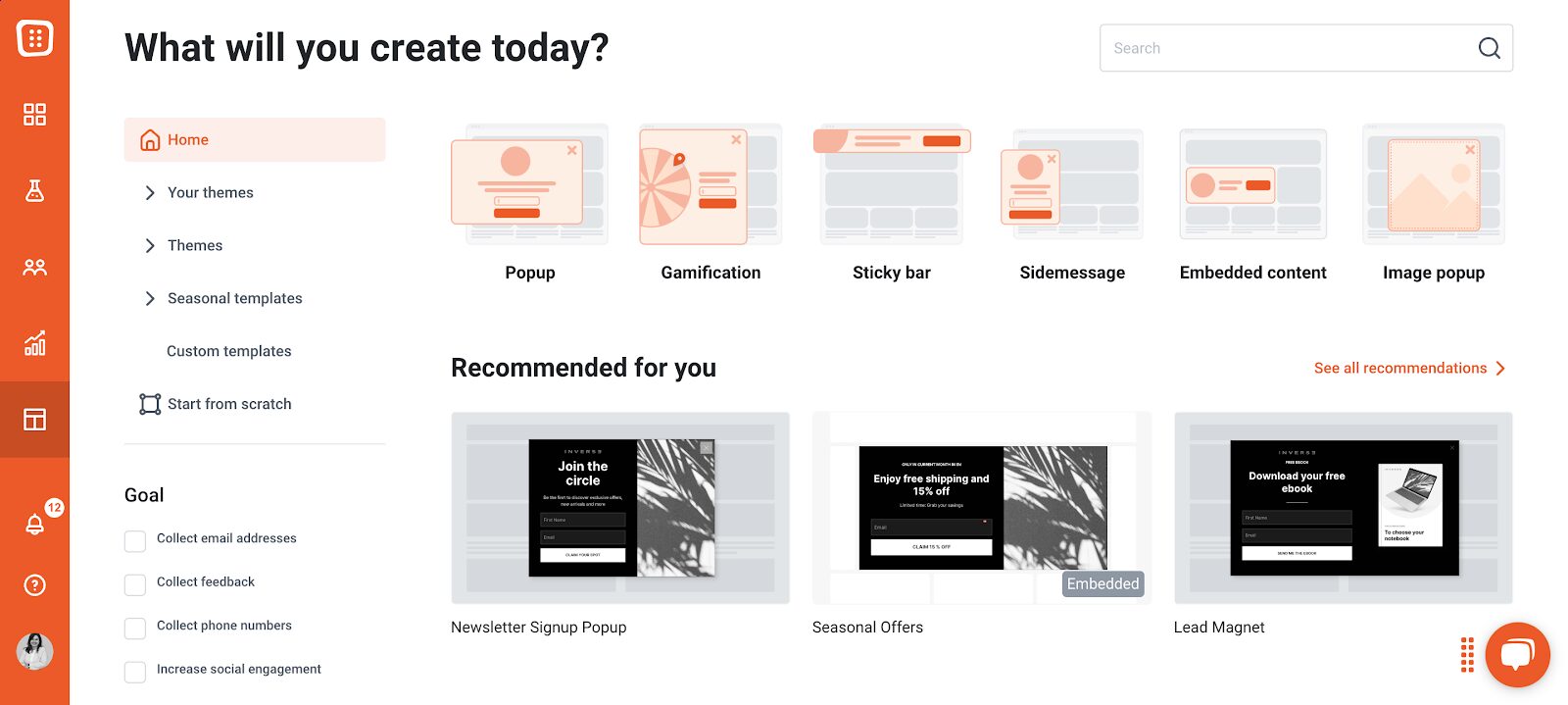
Whether you’re aiming to collect email addresses, promote a special offer, or provide important information, there’s a template for you.
Step 3: Customize your pop-up
Now, it’s time to make the pop-up your own. Customize the text, colors, and images to align with your brand’s style and the message you want to get across.
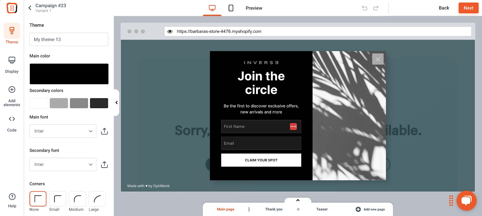
Use a compelling headline and clear, concise copy to grab attention and communicate your offer effectively.
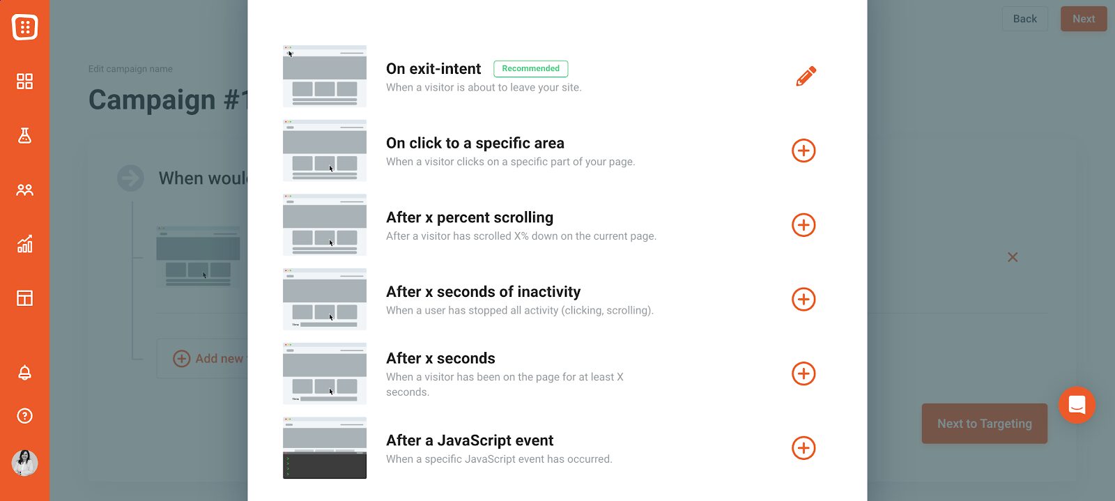
Step 4: Set triggers
Deciding when and where your pop-up appears is crucial for maximizing engagement. OptiMonk lets you set various triggers based on user behavior and timing.
Step 5: Publish
Once you’re satisfied with your pop-up design and settings, it’s time to go live. Review your pop-up one last time to ensure everything looks perfect and works correctly.
Then, save your changes and publish the pop-up on your site!
FAQ
Can I use landing page popups on mobile devices?
Yes, landing page popups can be effectively used on mobile devices. However, it’s crucial to ensure that they’re optimized for smaller screens and provide a seamless user experience.
How do I measure the effectiveness of my landing page popup?
There are several key metrics that can help you do this:
- Conversion rate: Track the percentage of visitors who take the desired action.
- Click-through rate: Measure the number of clicks on the popup’s call-to-action.
- Exit rate: Analyze whether the popup affects bounce rate.
- A/B testing: Compare different popup variations to identify the best performers.
Can landing page popups affect my website’s SEO?
While properly implemented popups should not negatively impact SEO, intrusive interstitials (popups that cover the main content) on mobile devices can lead to penalties from search engines like Google.
To avoid this, use non-intrusive formats and ensure popups are SEO friendly.
Are landing page popups annoying to users?
Landing page popups don’t have to be annoying—it’s all about using them in the right way. Make sure you’re using them correctly by ensuring relevance, providing valuable content or offers, timing them appropriately, and making them easy to close.
Poorly designed or overly intrusive popups can frustrate users and lead to higher bounce rates.
Wrapping up
Landing page pop-ups, when used the right way, can be a powerful tool to boost conversions, engage users, and drive specific actions on your site.
By following best practices and continuously testing and optimizing, you can create pop-ups that provide real value to your visitors without being intrusive.
Ready to give it a try? Start creating your pop-ups today with OptiMonk and watch your engagement soar!
Migration has never been easier
We made switching a no-brainer with our free, white-glove onboarding service so you can get started in the blink of an eye.

What should you do next?
Thanks for reading till the end. Here are 4 ways we can help you grow your business:
Boost conversions with proven use cases
Explore our Use Case Library, filled with actionable personalization examples and step-by-step guides to unlock your website's full potential. Check out Use Case Library
Create a free OptiMonk account
Create a free OptiMonk account and easily get started with popups and conversion rate optimization. Get OptiMonk free
Get advice from a CRO expert
Schedule a personalized discovery call with one of our experts to explore how OptiMonk can help you grow your business. Book a demo
Join our weekly newsletter
Real CRO insights & marketing tips. No fluff. Straight to your inbox. Subscribe now
Share this article
Written by

Barbara Bartucz
Barbara is a Content Marketer at OptiMonk. She takes pride in creating different forms of content, whether it’s an article, a video, or an e-book.
You may also like
- Posted in
- Conversion
Partner with us
- © OptiMonk. All rights reserved!
- Terms of Use
- Privacy Policy
- Cookie Policy
Product updates: January Release 2025


