- Blog
- 12 Ecommerce Popups to Grow Revenue & Email Subscribers in 2025
12 Ecommerce Popups to Grow Revenue & Email Subscribers in 2025
-
Nikolett Lorincz
- Conversion
- 6 min read
Table of Contents
Today, we’ll show you how you can use ecommerce popups to enhance your customer journey.
And we know what you’re probably thinking—popups are annoying.
But they don’t have to be.
You can use popups to deliver personalized messages to your visitors, collect feedback, and recommend relevant products.
Want to learn how?
We’ve got 12 popup examples from ecommerce stores to help you increase newsletter subscriptions and grow your bottom line. And as a bonus, we’ll also show you how to use OptiMonk to create popups that turn visitors into shoppers.
Let’s jump in.
What is an ecommerce popup?
An ecommerce popup is an attention-grabbing overlay that appears on an ecommerce website to engage visitors, offer discounts, or collect valuable information.
They can be triggered by various user behaviors, such as scrolling to a certain point on a particular page, spending a set amount of time on-site, or attempting to exit the website.
Popups can serve multiple purposes in ecommerce, from offering discount codes, announcing flash sales, or promoting new products, to gathering email addresses for future marketing. They’re often used strategically to increase email sign-ups, reduce cart abandonment, or guide users through the purchase journey by highlighting limited-time offers.
Despite their sometimes disruptive reputation, when designed well with relevant, valuable content, ecommerce popups can significantly enhance the shopping experience.
12 ecommerce popup examples to inspire you
Now that we’ve covered the basics of ecommerce pop-ups and how they can benefit your online business, let’s dive into 12 inspiring examples of effective ecommerce popups that can help you grow revenue and boost your email and SMS lists.
1. Use popups as micro landing pages

We researched and found that OptiMonk customers enjoy an average of 15% increase in conversions by using popups as landing pages.
Want to know why? They’re better for your user experience.
You don’t need to redirect visitors to a standalone page to get them to download your ebook or join your email list. Just use ecommerce popups to generate awareness around your campaigns.
You can easily add popups to your website and target users based on their browsing activity. That way, you choose who sees your offer and when—so your “mini landing pages” are delivered to the right audience every time.
2. Segment and personalize your ecommerce popups
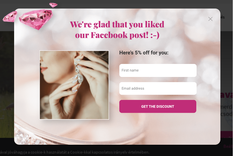
Now, let’s learn a little more about targeting visitors based on their browsing activities.
Nobody wants to see the same popup every time they visit an ecommerce site—and they shouldn’t have to.
Using OptiMonk, you can easily segment visitors by:
- The web pages they’ve visited.
- If they’ve interacted with prior OptiMonk campaigns.
- Whether they are/aren’t a newsletter subscriber.
- Country, traffic source, and more.
Just how effective is this strategy? Check out this case study from Czár Jewelry (pictured above). They boosted their revenue by 26.2% by sending personalized popups to visitors coming from Facebook.
3. Recapture sales with product recommendations
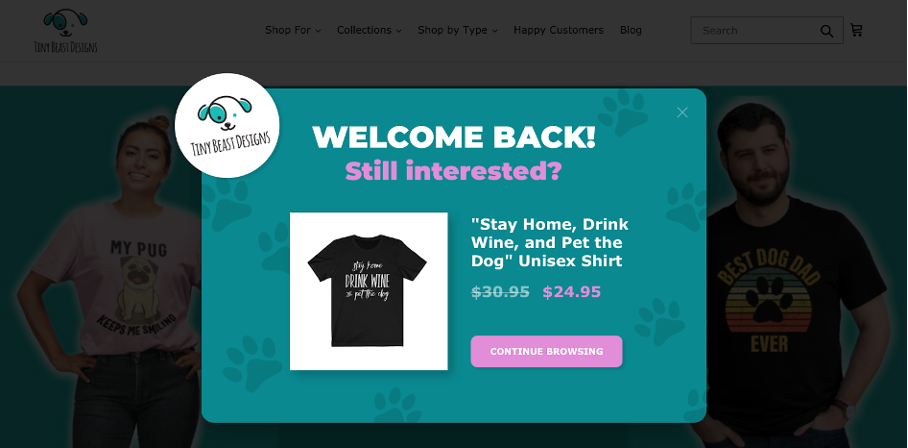
You’ll always get visitors eager to browse your site—only to leave empty-handed at the last minute.
Convert some of them into customers with a popup using OptiMonk’s Dynamic Product Recommendation. This feature shows returning visitors the product they were looking at the last time they browsed your site. Use this method to recapture some of your lost sales with a personalized popup.
Tiny Beast Design used this feature in their popup campaigns and increased their conversion rate to an amazing 30.56%.
Use these entry popup templates if you’d like to set up a similar campaign:
4. Tell visitors about your shipping policy
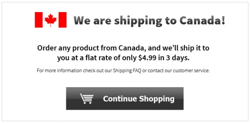
The number one reason for cart abandonment is unexpected shipping costs.
So, you don’t want to hide the shipping policy in your footer and give visitors any surprises that could lead to cart abandonment.
Your shipping information is something every visitor wants to know about. So, advertise it with an ecommerce popup and watch your conversion rate improve.
You can use this popup template to tell visitors about your shipping policy:
5. Use dynamic country detection to personalize your message
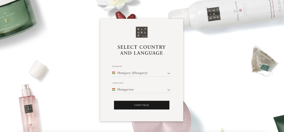
Personalization is at the top of the list of best practices for ecommerce popups. And dynamic country detection is an awesome way to personalize your onsite messages.
Use dynamic country detection to segment your visitors based on their country. With this feature, you can:
- Create multilingual popups: Create English popups for British and American visitors, German popups for people in Germany and Austria, etc. Watch conversions increase as you speak to visitors in their own languages.
- Send shipping information: Have different shipping policies for domestic and international orders? Create popups explaining your policies and target visitors based on their country.
- Run holiday promotions: Personalize your promotional events. Target Americans with Independence Day sales, Australians with Australia Day sales, and so on.
Rituals (pictured above) uses dynamic country detection so shoppers can access the website in their preferred language.
Visitors can read the website in the language of the country they’re currently in, or they can select a different language (like French, English, or Dutch).
6. Capture newsletter subscribers
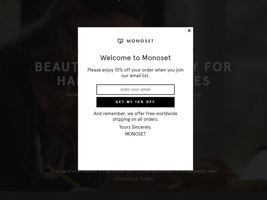
Newsletter popups are a great way to grow your subscriber base without using pushy marketing tactics that damage your user experience.
You’ll always have visitors who land on your ecommerce store and leave without buying something. Instead of forcing a sale (and ultimately driving them away), use this as an opportunity to get their email address.
Offer them a great deal, like free shipping or a 10% discount on their first order. You get to recapture the sale by adding them to your email marketing campaign. And they get a discount on their first purchase, so they’re more likely to convert.
Here are some email popup templates you can get started with:
7. Get more followers on social media
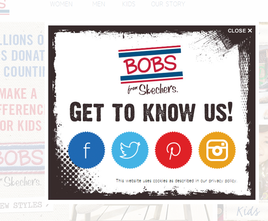
Did you know more than 80% of adults between the ages of 18-49 are active on social media?
Facebook, Instagram, and Twitter can be just as effective as your email campaigns when it comes to driving conversions. Why not use popups to gain more followers?
The example above is an effective way to integrate your popup campaign with your social media campaigns.
You can create exit-intent popups that target visitors before they bounce from your e-commerce site. Ask them to follow you on social media so they can stay up-to-date with your products and deals.
Check out the templates below and integrate social media into your popup strategy.
8. Promote your sales and discounts
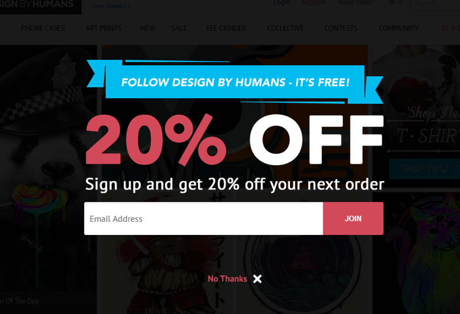
Offering a truly great deal?
Spread the word with an ecommerce popup.
This is an excellent opportunity for you to grow your email list while driving sales.
You give customers an irresistible offer like 20% off on their next purchase. And in exchange, they give you their email addresses. You increase your chances of making the sale, and you have more subscribers for your email marketing campaigns.
Just remember, good ecommerce popups enhance your user experience, not undermine it.
This type of onsite message should be an exit-intent popup. That way, you can target people before they bounce without disrupting their browsing experience.
9. Collect feedback from your customers
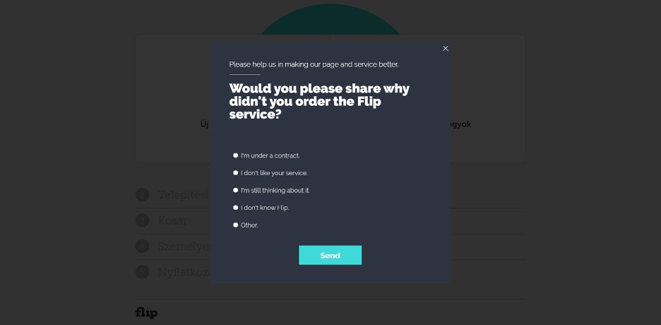
Want to know the secret to getting lifelong customers? Create an awesome customer experience that makes them want to come back.
86% of customers are happy to spend more at your ecommerce store if you give them an amazing experience. You have to listen to your customers to create that experience. You have to know their needs, shopping preferences, and what they love and hate.
Luckily, you can use popups to ask customers questions.
A popup survey targeting cart abandoners is a great way to learn why your customers didn’t complete their order. Or you can have a simple popup at the end of their purchasing journey that asks customers about their onsite experience.
Both scenarios help you collect valuable feedback you can use to enhance your customer experience.
10. Advertise your best-sellers
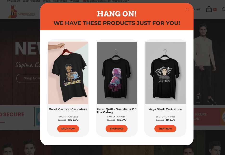
Have an item on your site that’s selling like hotcakes? Promote it on your category page so every customer can see it.
Adding a best-seller popup to your ecommerce store is an excellent way to increase sales. You get to help visitors with their purchasing decisions by showing them product recommendations mixed with a little social proof.
Check out these ecommerce popup templates promoting best-sellers:
11. Use urgency to drive sales
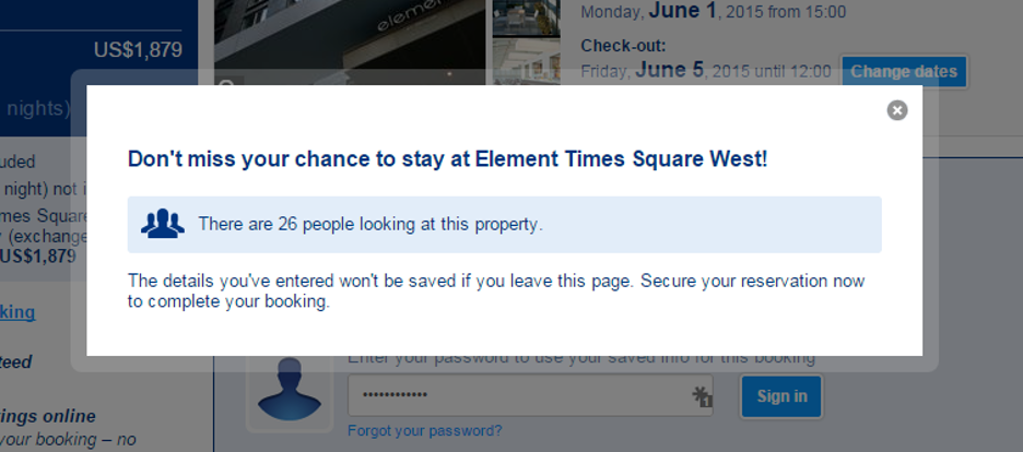
Urgency is a great tool for driving sales on your ecommerce site. Give customers a limited-time deal or tell them an item is close to selling out. They’ll be more likely to take action.
This is the FOMO (fear of missing out) effect. Most people don’t want to be excluded from an amazing offer.
You can use it to enhance your sales and marketing efforts by:
- Adding a countdown timer to your discount or deal.
- Letting customers know when items are close to selling out.
This strategy uses urgency and scarcity to motivate customers to take action right away… or they risk missing an amazing deal.
12. Alert visitors when products are back in stock
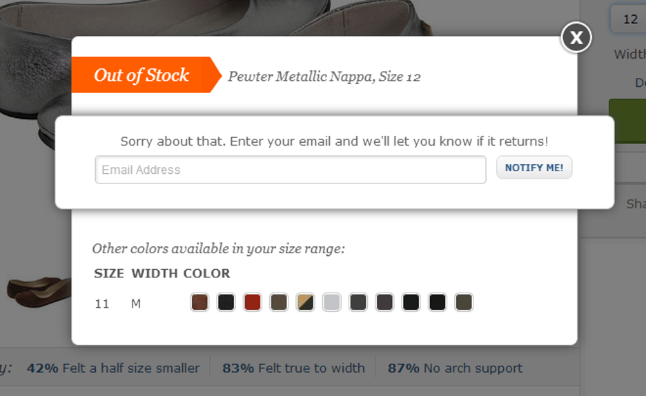
Most customers will leave your site empty-handed if you don’t have the product they’re looking for.
Don’t let inventory issues contribute to your bounce rate. You can guide those customers back to your store by putting this popup on your product page. It asks for your visitor’s email address, so you can notify them the moment you restock your inventory.
And that’s how you recapture a sale.
How to maximize the impact of your ecommerce popups?
Now that we’ve explored 12 impactful ecommerce popups designed to grow revenue and boost email subscribers, the focus shifts to ensuring these popups not only capture attention but convert effectively.
Personalization stands out as the cornerstone of a successful popup strategy. Users are inundated with information, making it crucial to cut through the noise and deliver messages that directly align with their interests and preferences.
One effective way to enhance relevance is by tailoring your popup content to each visitor’s unique needs and behaviors. Understanding the specific pages they are exploring and their interactions with your site provides valuable insights.
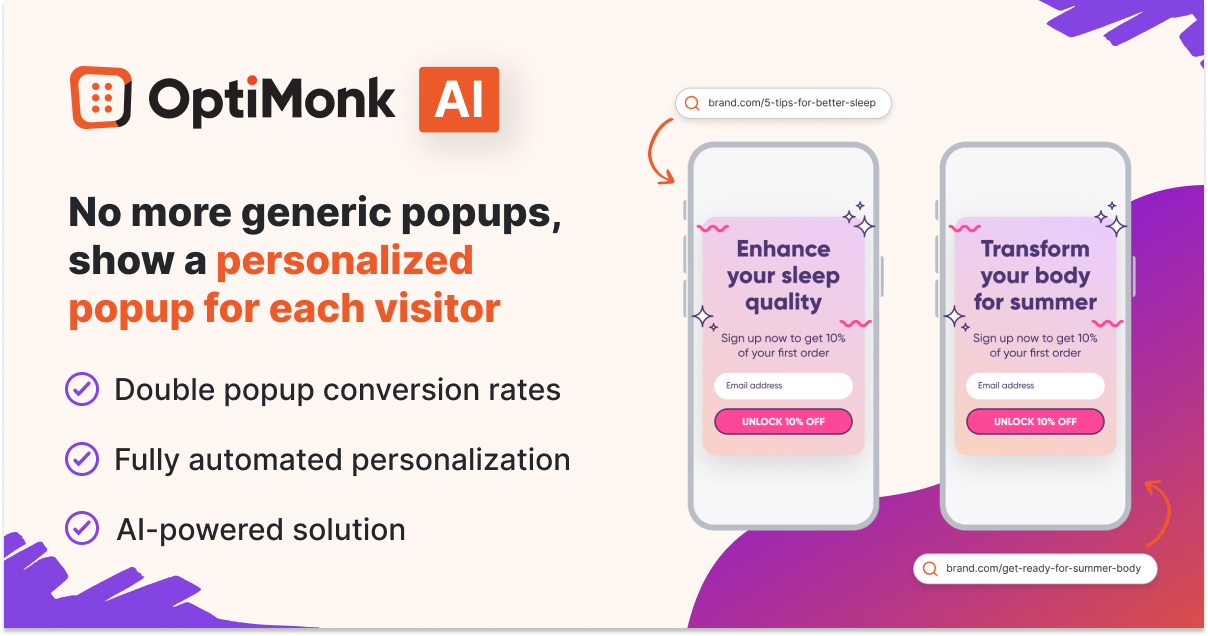
To take your personalized approach to the next level, consider leveraging advanced tools such as OptiMonk’s AI-powered Smart Popups.
This solution eliminates the need for manual customization by automatically tailoring the messaging of your popups to each visitor’s interests. The result is a seamless and dynamic experience that adapts to the unique preferences of individual users, without requiring additional manual effort.
How to create an ecommerce popup using OptiMonk?
Check out the guide below to see how easy it is to launch your first OptiMonk campaign.
Step 1: Register for a free OptiMonk account
Our free version of OptiMonk offers most of the features our premium packages have. And when we say free, we mean completely free—no credit card required.
You can play around with the platform, recreate the popup examples covered in this post, and add OptiMonk campaigns to your site without paying a cent. You never have to worry about upgrading to a premium version unless you want more monthly pageviews.
Step 2: Select a ready-to-use template
Our Template Library offers an expansive selection of templates for all types of ecommerce sites. You’re bound to find a theme that complements your website content.
You can also create your popups from scratch if you have a specific design in mind.
Take a look at some of our most popular ecommerce popup templates:
Step 3: Customize your popup
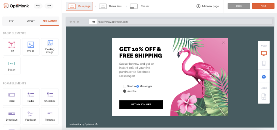
After you select a template, you’re taken to our drag-and-drop editor. This is where you’ll customize the way your popup looks.
You can:
- Choose the font, size, and color of your message.
- Add images to your popup.
- Change the color of your popup.
Most popups consist of three pages:
- The main page: This is your actual popup message.
- The thank-you page: A message thanking your visitor after they convert.
- The teaser: A small image on your website that visitors can click to see the popup. This is optional.
Step 4: Set your configurations
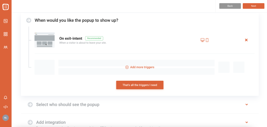
Now you need to decide who sees your popup and when. This is where you can really personalize your onsite message.
You can choose to target visitors based on exit-intent, which means they’ll see your popup just before they leave. Or you can deliver the popup:
- After a visitor spends a specific amount of time on your site.
- When your visitor clicks through a specific part of your site.
There are tons of options. You can also choose who you want to target. Some options include targeting:
- Visitors who come to your site from Facebook.
- First-time visitors.
- Repeat customers.
Get creative and explore all the ways you can customize your popup.
Step 5: Launch your campaign

Don’t forget to change the “Inactive” to “Active” button on your campaign when you’re ready to launch.
Wrapping up
As you can see from the examples in this post, not all websites with popups are bad. When used correctly, popups add value by helping shoppers make better purchasing decisions. But this requires a mindset shift.
Instead of using popups to drive short-term sales, use them to improve your shopping experience—so customers want to return.
Learn more about how to run popups that will increase your revenue up to 10 times by downloading our Ultimate Guide to Popups.
Ready to create amazing ecommerce popups like the examples covered in this post? Sign up for your free OptiMonk account today to get started. We’ve got a dynamic support staff to guide you if you have any questions!
Related articles:
Migration has never been easier
We made switching a no-brainer with our free, white-glove onboarding service so you can get started in the blink of an eye.
What should you do next?
Thanks for reading till the end. Here are 4 ways we can help you grow your business:
Boost conversions with proven use cases
Explore our Use Case Library, filled with actionable personalization examples and step-by-step guides to unlock your website's full potential. Check out Use Case Library
Create a free OptiMonk account
Create a free OptiMonk account and easily get started with popups and conversion rate optimization. Get OptiMonk free
Get advice from a CRO expert
Schedule a personalized discovery call with one of our experts to explore how OptiMonk can help you grow your business. Book a demo
Join our weekly newsletter
Real CRO insights & marketing tips. No fluff. Straight to your inbox. Subscribe now
Nikolett Lorincz
- Posted in
- Conversion
Partner with us
- © OptiMonk. All rights reserved!
- Terms of Use
- Privacy Policy
- Cookie Policy
Product updates: January Release 2025
